Concepts for user listening trend graphs for Last.fm showing how much music a person scrobbles from day to day, and how much they are discovering new music or listening to old favourites.


Concepts for user listening trend graphs for Last.fm showing how much music a person scrobbles from day to day, and how much they are discovering new music or listening to old favourites.
For services that work across multiple platforms it’s important to keep a consistent style across UI elements. Various platforms and operating systems have their own native UI elements, but you can still add brand characteristics. At the end of each project I put together a grid of all the UI elements, as a quick reference for any future project. There is also a master UI matrix comparing elements across platforms, i.e. how does a play icon look on iOS compared to Android, and can it still reflect the brand?

iOS GUI schema

Desktop version schema

Stuff Magazine had a feature on ‘Best of British’ hero brands and products, Last.fm was No.8 and to illustrate the service they asked for some infographics.


It may not seem like much, and it’s no yellow pencil, but this means more to me as I LOVE the Guardian Datablog. It’s a shame the colour fooked up in the screenshot they did. Don’t now what happened there.

![]()

“We don’t have the time for psychological romance”
– Larry Blackmon, Cameo
As my missus will testify, I’m not very romantic and greetings cards make me nauseous. So I wasn’t looking forward to designing a feature for Valentine’s Day.
Then I realised it might be interesting to use music data to see if anyone else felt the same or if Valentine’s day was full of hopeless romantics playing “Somebody To Love” by Jefferson Airplane back-to-back like saps.
So I went to see Omar…
I don’t pretend to understand what Omar does, I like to think his job involves “running things through the computer”. He is always very patient with me, even when I ask him silly questions like: “Do you think David Hasselhoff’s audience was affected by the drunken cheeseburger + floor-as-plate incident?” (it did, the Hoff gained an extra 400 scrobbles that week). Omar was more than happy to dig into the Valentine’s Day stats, especially when I said I wanted to compare the music tags “romantic” with “sex”. I’m always running the word “sex” through the computer and it never takes long.
To get a clean set of Valentine’s data to analyse, Omar compared the listening behaviour on 14 Feb over a number of years to the behaviour on any other day of the year, normalised it to remove erroneous “new release” spikes, thereby sifting out the tracks unique to Valentine’s Day. Then we went to work with the location and genre tags.
This gave us a list of cities ranked from Sexy to Romantic and the proportion of sexiness for each.
Looks like I need to head to Fresno on 14 Feb!
![]()
![]()
A logo for a Valentine’s Day feature on Last.fm. I’m not very romantic and chintz makes me nauseous, so I wanted to avoid the cliches on this logo. As this was for a music site, I felt the Ziggy Stardust lightning bolt was a better representation of love than the typical Clintons Cards heart shape. I knew I’d found the right solution when someone commented “it looks like a heavy metal band logo!”.
The font is set in Eagle Black. The colour came about by chance… When you add a colour overlay to a layer in Adobe Photoshop, the application default colour it always applies is #ef4836 (M: 87% Y:84). I’ve always like that colour and wanted an excuse to use it.


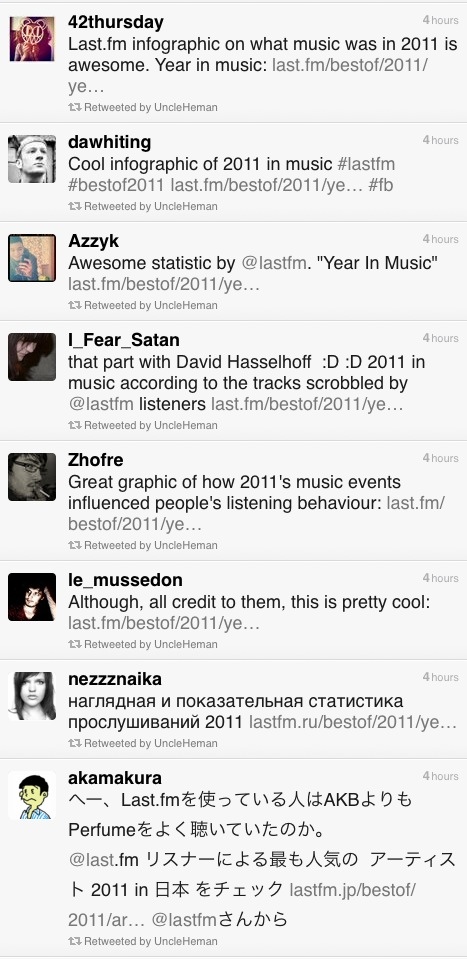
I was pleased to get a surprise present from my work-fellow @baseonmars… It’s the Last.fm “Best of 2011” infographic as an A2 poster, with a gorgeous matt finish. Thank you! He wanted a framed one for his wall at home and got me a copy… because he is awesome.

To get this to work in two columns on A2 format I had to add an extra scrobble graph not seen on the original Year in Music freature: Rebecca Black goes viral: 11 Mar – “Friday” goes viral and is dubed “the worst song ever”.
Getting some good tweets on the Last.fm Best of 2011 infographic…
")
Every year at this time, most music sites give you a run down on the best acts of the year. Generally, sites start rolling out “Best of” features in December, however at Last.fm we decided to wait until January so that we can show a complete year’s worth of data. This year we’ve also added a datavis feature, which shows key Last.fm stats, including the music news events of the year that made a noticeable change in an artist’s listening levels – or scrobbles.
To create this, we polled our colleagues across the CBS Interactive group for what they felt were the key music events of the year. I then used our internal trends tool to see if the artists featured in these events had any corresponding spikes in their listening data, based on actual total daily scrobbles. To my surprise, most of the shortlisted news events had encouraged listening, showing clear spikes. The only HUGE event that hadn’t really had any effect on listening was David Hasselhoff’s birthday. The Hoff is the Last.fm mascot and his birthday is always big news here in Old Street, but sadly not with the wider world. However he did have some huge spikes in 2011, which a quick check on Wikipedia proved to be related to a come back tour in Germany and Austria, who also have great taste in idols.
The Steve Jobs tribute was the last one to go in. I wanted to do a tribute to Steve (mostly because I am addicted to my iPhone and iPad), but mostly due to his huge impact on the world of music. The trouble is he’s not an actual artist (or so I thought), so he doesn’t have listeners to create a graph from. Instead, I used our site statistics to show how Apple devices are represented in Last.fm visitor levels. It was only later that I learned Steve Job DOES have an artist page, as many of his keynote speeches and addresses have been shared as audio files and podcasts, which do actually “scrobble” … and yes, there was a spike after his death in October.

")
Last.fm is a global company and provides translations in 10 languages. Translation is usually added into the html, but as the datavis was a graphic, yours truly had to edit the translations by hand, which was fun, as not all the character sets would work in the cut of Helvetica Neue I had. Also, sentence length in translations can be a huge layout issue, especially if tabs are used. In this case the annotation of the charts took up a lot of room and needed to be considered early on. Contrary to popular belief German wasn’t the most problematic in terms of sentence length; Russian caused the most formatting problems, followed closely by Polish.
 translated into Japanese")
Some spring cleaning on Last.fm to clean up the typogoraphy on the site. A small change, but one that will make me very happy ; )
")
The first step is to make the heading levels more distinct, so there is a clearer visual hierarchy. Heading levels should have the same effect as the old eye test, noticably diminishing in size. The current site headings are a bit samey. This helps the bowser to understand how the page is divided and gives a “vertical rythm”, making it easier to scan down the page to find omething specific.
Secondly, we need to clean up the CSS and html, so that the structure of the content follows the intended visual and semantic hierarchy . H1 for page title, H2 to divide content in main themes/sections, and H3 headings to title separate under each H2. These changes will make the page legible without the stylesheet, which is not only good practice, but also frees the content for use in multiple contexts (such as mobile/tablet).

As these changes effect the structure of the site we can’t just roll them out site-wide. They’ll be included as we update various sections of the site, the first being Last.fm Charts.
CSS gurus say you should not use units like “px” or “em”. It is naughty. In this case I have used united px values as a guiding principle, the CSS will probably be unitless.

I’ve been working on a refresh of the “Charts” section of the Last.fm site, including a new filtering options for “Hype”, “Top Artists” and “Top Loved Track”. This first launch only includes filtering by date, a later release will include “genre” and “location” filters, so that you’ll be able to can see the best “electronic” music or “black death metal” in your home town. Have a play at last.fm


Brief: Conceptualise and a music discovery app for WebOS. Timeline: 1-2 weeks.
Concepts, wireframes and visual design for a Last.fm music discovery app. Currently without a stable home (As of 18 Aug).


Wireframes below – the notes have ben removed (so I don’t have to worry about too many typos out in the wild ; ) !

Cold start experience – a way for new users to quickly add artists to their library

Exploring artists and recommendations

Exploring artist’s biography, images and top tracks

Playing personalised radio with slide show and listening stats overlay

GUI doc

Initial sketches of the interaction model


In an effort to maintain consistency and quality of our application icons, I have been collating a GUI (Graphical user interface) reference doc. As we produce applications on different devices and platforms, we need to take native UI styles and features into account. Although there can be no “generic” iconon all platforms, we can still achieve a consistency of drawing shape and general ‘character’ of icons across apps. For instance: to create tab and activity icons in iOS you provide white shapes on transparent backgrounds, the “blue gloss” styling is added dynamically within the app.
This matrix is more of “how are we doing” document to see if Last.fm style shines through the veneer of native UI styling. The grid shows platforms in columns (names removed for confidentiality of work in progress) and the rows display the various activity states: rest, hover, press)
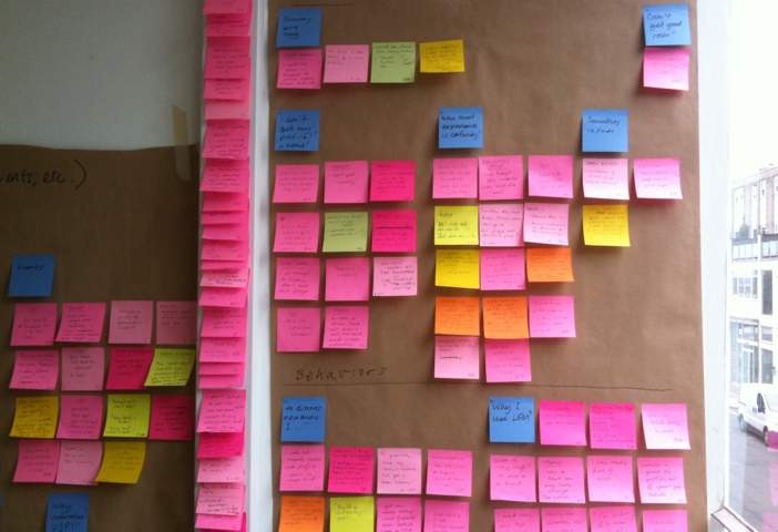
My favorite place: testing stuff in the lab behind a one-way mirror. I moderated a couple of the sessions, which were with existing LFM users. We hired the excellent user research fascilities at Flow Interactive in Clerkenwell, mostly because they have air-con and a fridge full of coke.
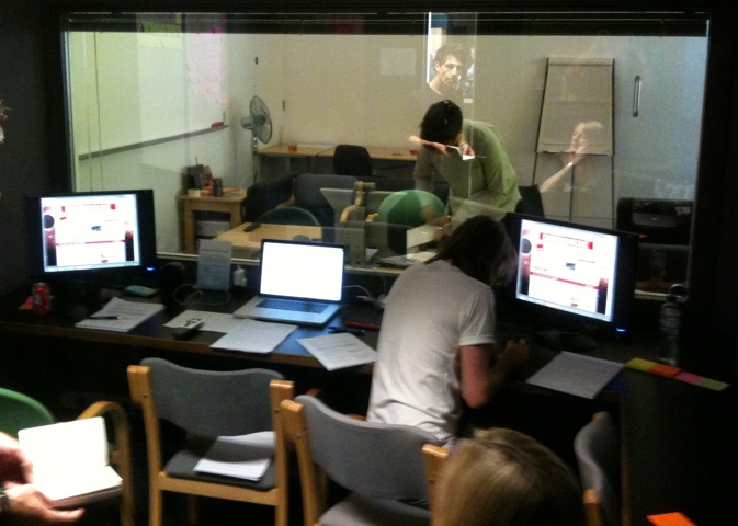
We made notes on post-its, one observation per note, with quotes from users to back up observations. We used rolls of brown paper to collect and store the notes for taking away later, the paper was divided into the broad themes we were testing. Back at the office we sorted the post-its more thoroughly into columns under more exacting topics. Several people were taking notes so we had to de-dupe, however it was important to keep similar comments if made by different users, as this indicates that the issue might be more common to a wider group.
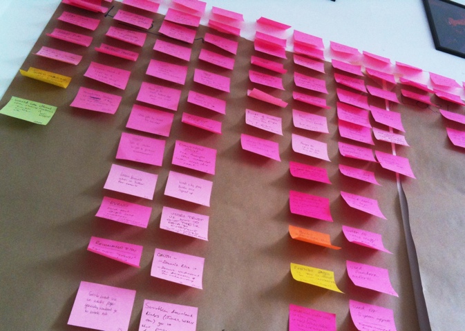
The next step is to do an “affinity sort” to look at each comment individually and sort them into groups based on perceived patterns, rather than features. It’s important to start quite freely and not to place a heading above the group or draw a conclusion too quickly. It’s basically finding groupings based on a gut feeling that different users were having similar issues. In this research session we were testing different features, such as “Events & Festivals” and “Artist Library”. In afinity sorting I noticed that a user who couldn’t find their recommended events was probably having a similar issue to a user who couldn’t find their recommended artists in the “library” section. These two notes were moved from their former “feature” headings into a new group called: “Issue with finding personal recs”. The issue had nothing to do with events or radio, it was a issue around users needing a uniform place to access all their personalised info.


![]()
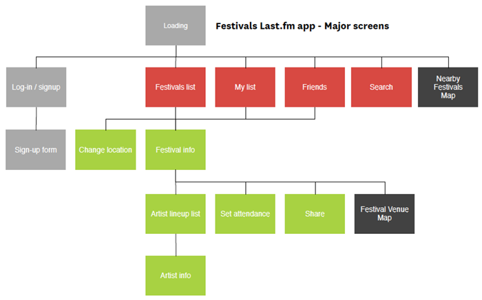
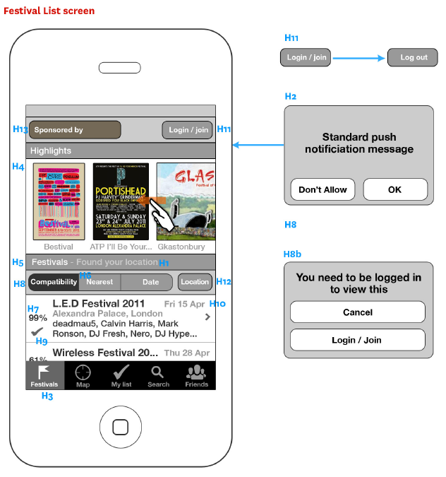
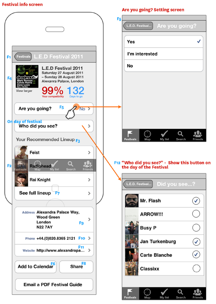
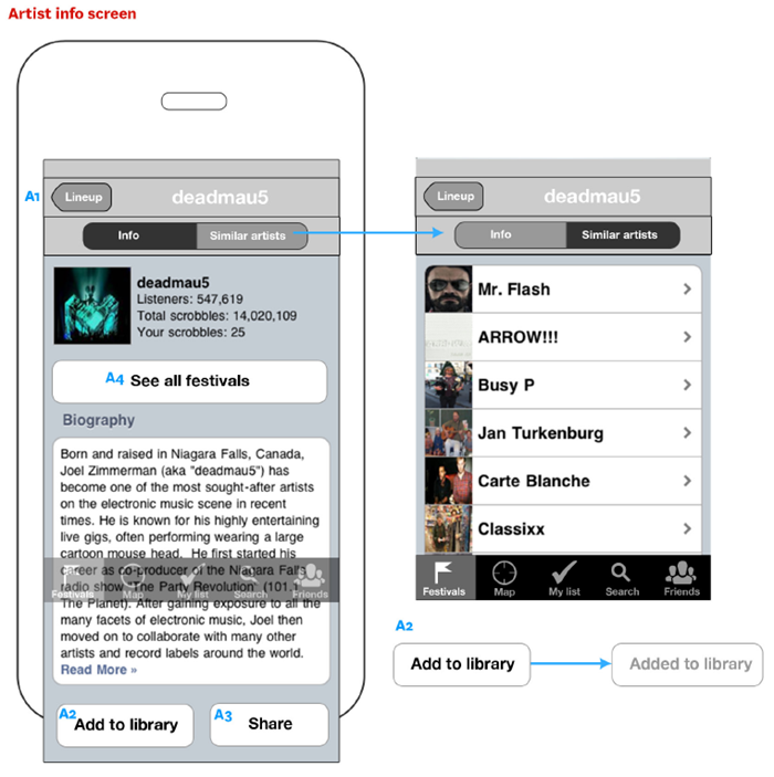
Last.fm Festivals app won a 2012 W3 Silver Award for the Music & Audio Mobile App category and a 2012 Mobile WebAward from the Web Marketing Association. You can download the app on iTunes here.


My part in the project was to: create a set of wireframes, work out the userflows, provide UI and marketing assets, and follow up with QA and bug testing.
Read more about it on the Last.fm blog
With the addition of their new Festivals app, 5 years of Last.fm data just became even more useful for me bit.ly/ettmpZ – @MattHurst
Last.fm Launches Amazing New Festivals App — t.co/egA2wjr #music – @Acecentric
Awesome new #lastfm smartphone application recommends music festivals according to your musical preferences t.co/EcleOJF – @Florianmaganza
Last.fm aims to making choosing which to attend easier with its new Festival application – Mashable
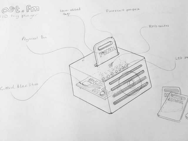
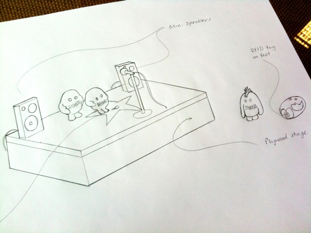
There are lots of boffins and whiz kids at Last.fm, and I’ve been task with conceptualising something they could make based on RFID tags for interacting with music data and streams. (RFIDs are little stickers with antennaes for use in contactless technology – like Oyster cards)
I’ve been sketch ideas for a fun way to change the genre of music on the reception radio stream using physical objects that have RFID stickers on them.
The first idea is for a stand-alone player using the guts of a Mac mini, stuffed in a box made of plywood, that has a slot in it for fluorescent perspex tag cards. Ram in the “pink” card and the box would light-up and the radio stream would switch to pure FUNK-FUNK. Other cards would be available… but only if you need something better than funk.
The other idea is to make little action figures based on the Last.fm “scrobblin” brand characters, with RFIDs on their feet that you place on a miniature stage containing the RFID reader. You could then make a mix stream by putting a number of scrobblin tags together to form a band, for instance: “electro emo funk rock”.

The artist who pianted this mural was using an old transparency projector to trace the art, so I needed to give him a clean line-art version of the original vector file. I also helped to slecet the colours. Although there was some initial confusion as he wasn’t given a definitive pantone…
There are actualy 3 reds in use across various mediums: Pantone 1797 & 1087 and Hex #d51007.
To keep things simple, and as the mural looks great in th sun… I’m now claiming Rectory Red is the official colour. Anyone who wants a swatch has to go and chip a bit off the wall.
It’s very easy to get lost when designing an app, but when you’re designing for a touch-screen experience, with gestures replacing clicks and scrolling, it’s even more complicated. Touch-screens introduce physical concepts to help the user navigate: spatial planes that you can “swipe” across, representations of physical objects, and zooming in and out and content. This makes the user flow in and out of content very tricky.
In a productivity app, like email, its better if a user can drill in and out of tasks in a straightforward way. Therefore the folder based metaphor of desktop operation systems makes sense. But for a more immersive experience where you want the user to get “lost” in the experience, you need a more “open’ and loose heirachy. In my experience, “Open” is very hard to develop… as it’s harder to anticipate all the possible routes and outcomes, so the UI presents consistent behavious where ever the user is.
In this example I’m looking at an immersive touch-screen way to explore music artists. A list of artists is presented as a photo grid (or quilt), and the user can zoom into the grid to look at an individual artist. They can then swipe left and right to see the next artist in the grid. This mixes two existing navigation metaphors: picture thumbnail gallery and a page-turn magazine experience. Phew.
But now the hard bit…
Every artist has similar, or related, artists. Daft Punk has: Justice, deadmau5, Digitalism, etc. We want to encourage the user to follow these connections and explore more artists freely, but at the same time, need to give them a clear way back to the start of the app.
The user zooms in on an artists, then when the click on a related artists, that opens another grid. In the programming model, each artist opens as a new level in the app, and each related artist grid is another level on top. Phew! The layers build and build, and for to get back to the start, do they have to press “back” through each of these layers?
Model 2
The user can zoom in and out of the grid to see artists, but if they want to click on a related artists, that launches a new grid in a new session. To get back, the user goes from grid to grid. It’s more like a concept of islands of artists, than levels. This will be much easier to develop, as each time you press to see a set or related artists, you are clearing he grid before, much like performing a new search.
If this comes across as an incoherent ramble, it is because my mind has been broken by too long in front of the whiteboard!

Some random sketches, thinking about a way to visualise the tricky concept of scrobbling. These are based on new stuff floating around in my head mixed with exisiting ideas and metaphors. So far I have: clouds, “scrobblins” (my new name for the brand characters created by the Rehab Studio), hearts, headphones & stethoscopes.
")
![]()
![]()
![]()
Based on existing illustration work from the excellent Rehab for the Best of 2010 site, this icon will be the new face of a desktop player app. I took the more anatomical heart drawing and simplified it, then added the woofer and tweeters for play-your-music-love-metaphor-iconess.