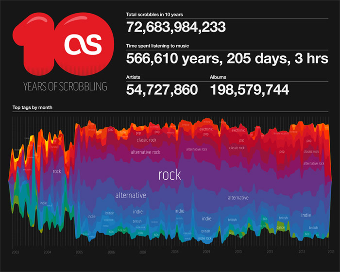
To mark the 10th anniversary of scrobbling, my colleague @stefansperber and I created this infographic showing how the top music genres have changed over the last 10 years. Stefan ran the data queries and produced vectors for the stream graph, I did the final infographic.
Category: infographic
Last.fm infographic Christmas card
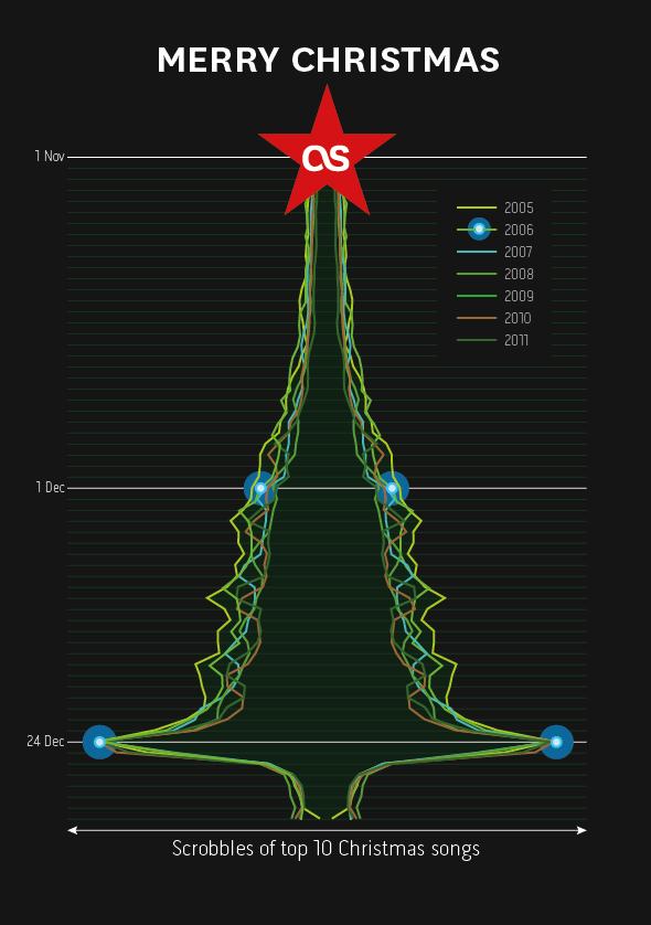
My dear colleague @dawhiting had the idea of looking at the scrobble graphs for the top 10 Christmas songs leading up to the 24th Dec. Over the last few years there has been a consistent spike. I did a bit of “pretty” work and now we have this year’s Christmas card design.
MOODmongr – music mood analysis & machine tagging
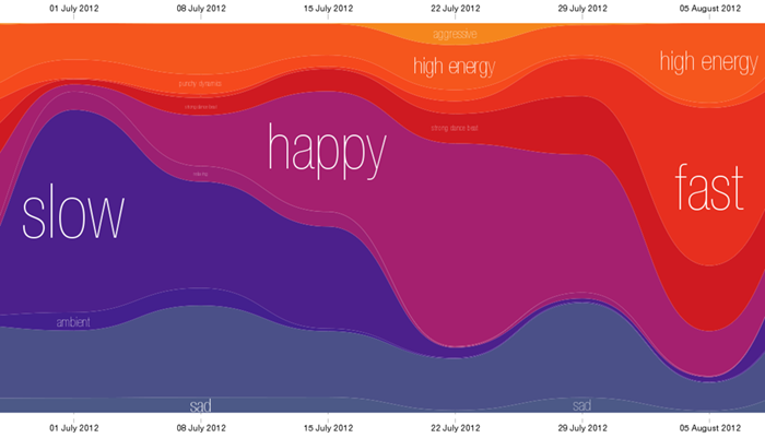
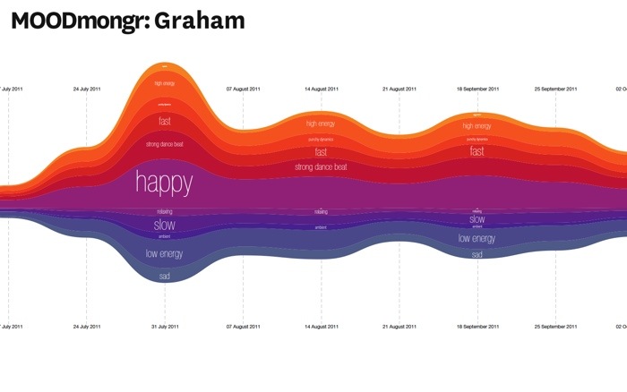
Continued from my previous post, my data team colleague Mark Levy has adjusted the mood chart to only show the percentage of moods in total music listening per week, removing the scaling that showed how much music a user was listening too. This makes it easier to see the variance in mood.
Here is my Moodmongr report or you can give the Mood report a try yourself.
Music Hack Day – MOODmongr
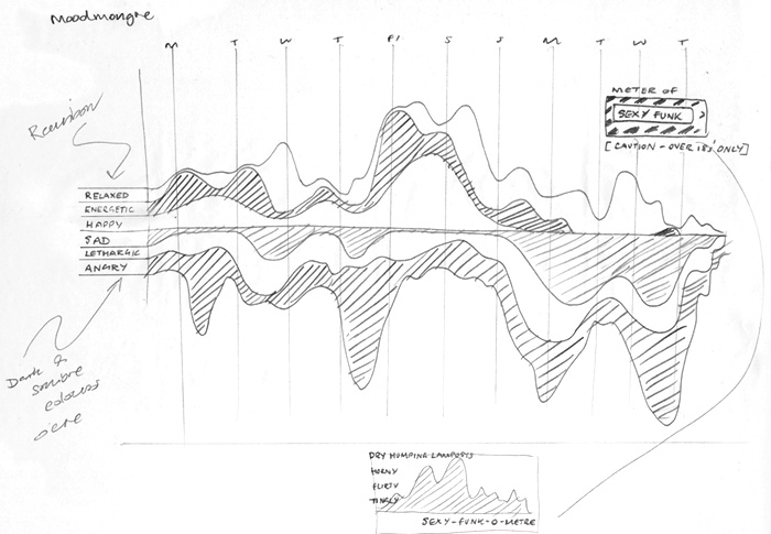
Sketch for an idea for a hack day at Last.fm. The theme is “user profiles”. I’m working on a project with Mark Levy, who leads the Music Information Retrieval team, to chart the mood of a user’s listening over time using new audio analysis tagging. We will be testing it on the team first!
I call it MOODmongr
The results
In general, the moods were pretty even across the year’s listening of my test group; my team mates. This was largely due to the fact that we all have varied music tastes and use radio steams and playlists for variety. However there were a few spikes and points of interest:
In the Guardian data blog – huraah
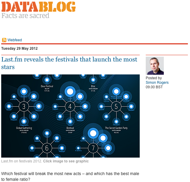
A nice post from Simon Rogers on the Festivals data visualisation I created with @Omar711. He rightly points out that Last’fm’s data scientists are also pretty good at visualisations, a refernce to Omar’s excellent “Day in music” visualisation which he designed.
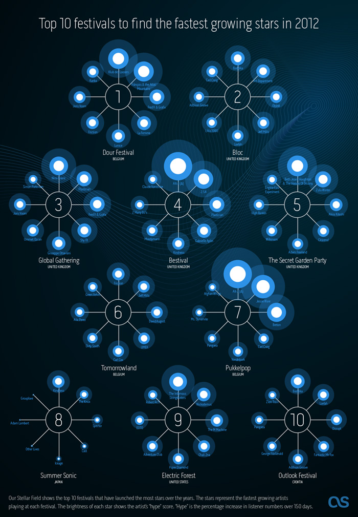
Last.fm Festivals “Brightest stars of 2012” infographic
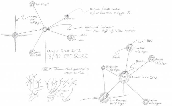
Last.fm can already recommend the most compatible festivals based on your current music taste, but what about discovering new music? We decided to use a bit of 10% time* to see if Last.fm listening data could be used to recommend the best festivals for seeing the future stars of summer 2012.
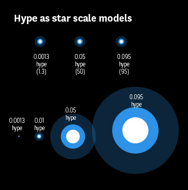
@Omar711, Last.fm’s data scientist, started by looking at new artists playing in festivals this summer to see which have a high “hype score”. Hype is our measurement of how fast an artist’s audience is growing over a short period of time. Then Omar looked at historical data for all festivals over the last few years to see how many artists had become successful (i.e. grew in audience) directly following the festival. This gave us a ranking of how influencial festivals were in growing new artists. We pulled out the top 10 for our infographic, and then highligthed the artists with the most hype.
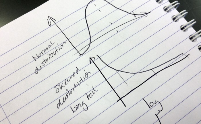
As we tend to call artists that have big audiences “stars” I thought I would use stars in my infographic (I find these dazzling leaps of lateral thinking exhausting). The hype scores would be represented as the brightness of the star. However, when I tried to convert the hype scores into percentages to scale the circles in my infographic, some were massive and other came out microscopic. So I called Omar over and he said “ah yes, skewed distrubution. Just use log or square root”.
Eh?
It must be strange for Omar to be working so closely with an idiot. A short math lesson later and I had a nice range of percentages to play with (and I felt a bit smarter, almost ready for my own PHD ;).
* staffers are given 10% of their time to work on self-driven projects, providing the work is related to music data (I have been told off for spending too much time working on a diorama of Jabba’s palace for my Star Wars figures)
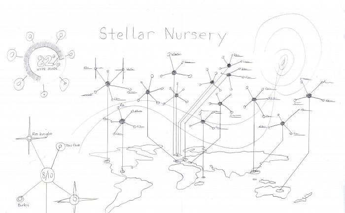
Last.fm Festivals “Brightest stars of 2012″ infographic – sketches
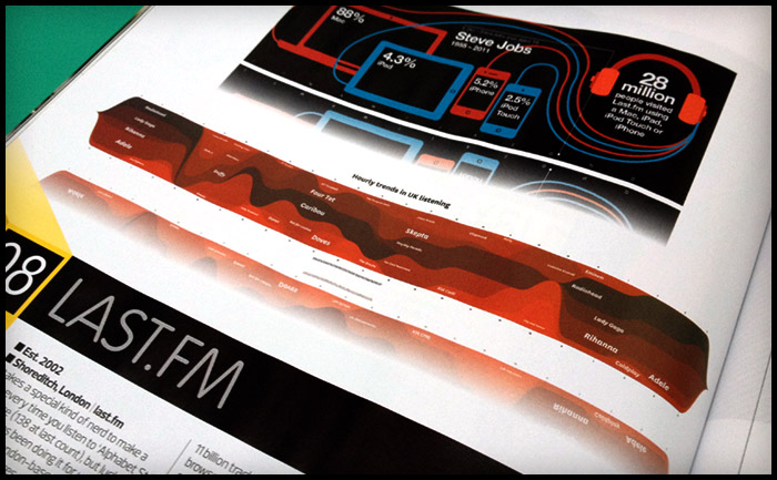
Last.fm infographic in Stuff magazine
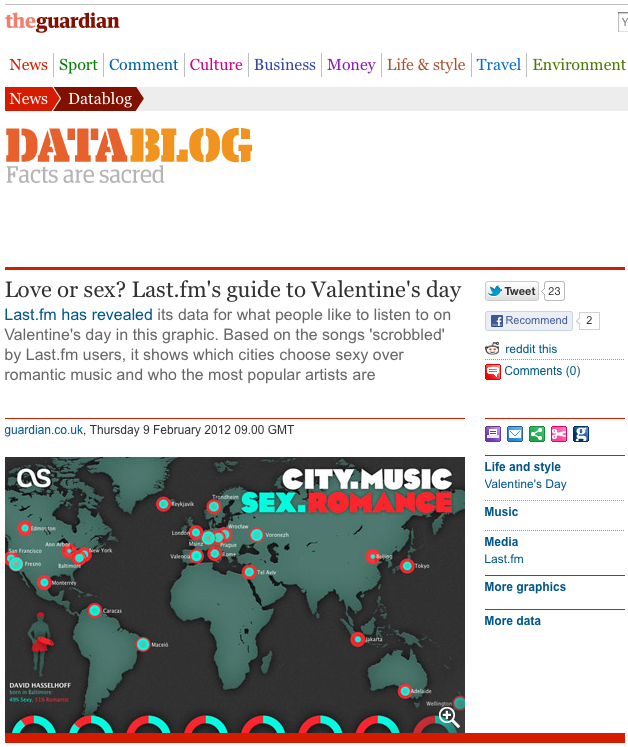
Last.fm Valentines infographic posted on the Guardian Datablog
Valentine’s Day Infographic on last.fm
“We don’t have the time for psychological romance”
– Larry Blackmon, Cameo
As my missus will testify, I’m not very romantic and greetings cards make me nauseous. So I wasn’t looking forward to designing a feature for Valentine’s Day.
Then I realised it might be interesting to use music data to see if anyone else felt the same or if Valentine’s day was full of hopeless romantics playing “Somebody To Love” by Jefferson Airplane back-to-back like saps.
So I went to see Omar…
Omar the Oracle
I don’t pretend to understand what Omar does, I like to think his job involves “running things through the computer”. He is always very patient with me, even when I ask him silly questions like: “Do you think David Hasselhoff’s audience was affected by the drunken cheeseburger + floor-as-plate incident?” (it did, the Hoff gained an extra 400 scrobbles that week). Omar was more than happy to dig into the Valentine’s Day stats, especially when I said I wanted to compare the music tags “romantic” with “sex”. I’m always running the word “sex” through the computer and it never takes long.
To get a clean set of Valentine’s data to analyse, Omar compared the listening behaviour on 14 Feb over a number of years to the behaviour on any other day of the year, normalised it to remove erroneous “new release” spikes, thereby sifting out the tracks unique to Valentine’s Day. Then we went to work with the location and genre tags.
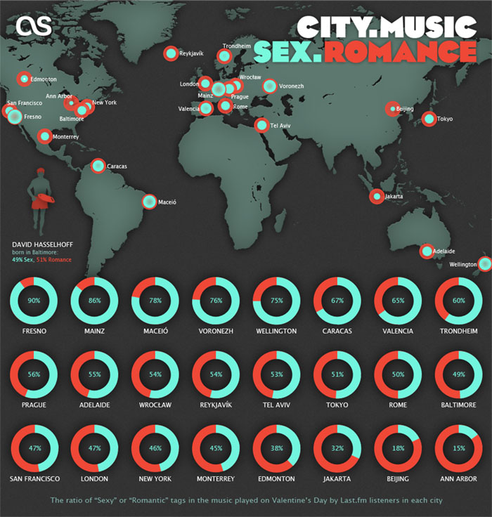
This gave us a list of cities ranked from Sexy to Romantic and the proportion of sexiness for each.
Looks like I need to head to Fresno on 14 Feb!
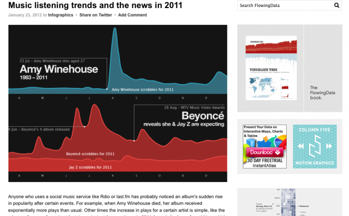
I made it onto FlowingData.com
Last.fm infographic A2 poster
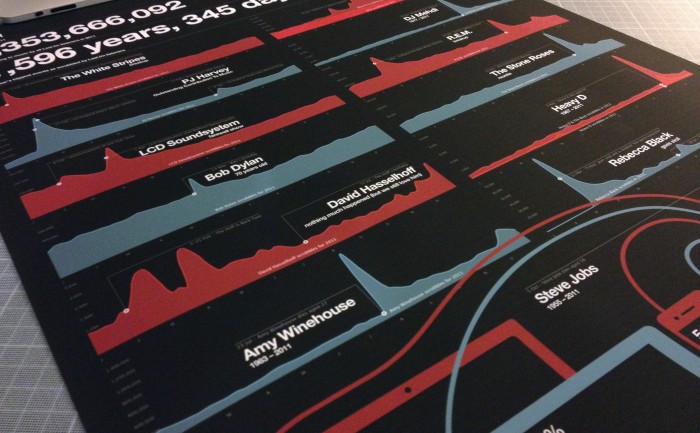
I was pleased to get a surprise present from my work-fellow @baseonmars… It’s the Last.fm “Best of 2011” infographic as an A2 poster, with a gorgeous matt finish. Thank you! He wanted a framed one for his wall at home and got me a copy… because he is awesome.
To get this to work in two columns on A2 format I had to add an extra scrobble graph not seen on the original Year in Music freature: Rebecca Black goes viral: 11 Mar – “Friday” goes viral and is dubed “the worst song ever”.
Last.fm music data visualisation (datavis / inforgraphic)
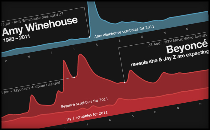
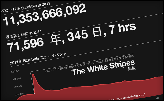
Every year at this time, most music sites give you a run down on the best acts of the year. Generally, sites start rolling out “Best of” features in December, however at Last.fm we decided to wait until January so that we can show a complete year’s worth of data. This year we’ve also added a datavis feature, which shows key Last.fm stats, including the music news events of the year that made a noticeable change in an artist’s listening levels – or scrobbles.
Making of
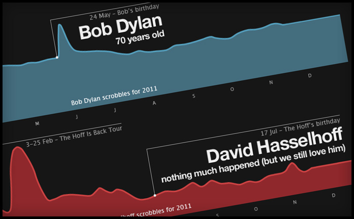
To create this, we polled our colleagues across the CBS Interactive group for what they felt were the key music events of the year. I then used our internal trends tool to see if the artists featured in these events had any corresponding spikes in their listening data, based on actual total daily scrobbles. To my surprise, most of the shortlisted news events had encouraged listening, showing clear spikes. The only HUGE event that hadn’t really had any effect on listening was David Hasselhoff’s birthday. The Hoff is the Last.fm mascot and his birthday is always big news here in Old Street, but sadly not with the wider world. However he did have some huge spikes in 2011, which a quick check on Wikipedia proved to be related to a come back tour in Germany and Austria, who also have great taste in idols.
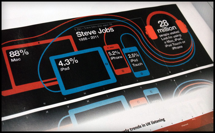
A tribute to Steve Jobs
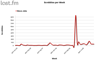
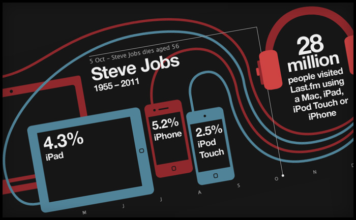
The Steve Jobs tribute was the last one to go in. I wanted to do a tribute to Steve (mostly because I am addicted to my iPhone and iPad), but mostly due to his huge impact on the world of music. The trouble is he’s not an actual artist (or so I thought), so he doesn’t have listeners to create a graph from. Instead, I used our site statistics to show how Apple devices are represented in Last.fm visitor levels. It was only later that I learned Steve Job DOES have an artist page, as many of his keynote speeches and addresses have been shared as audio files and podcasts, which do actually “scrobble” … and yes, there was a spike after his death in October.
Translation issues in web design
Last.fm is a global company and provides translations in 10 languages. Translation is usually added into the html, but as the datavis was a graphic, yours truly had to edit the translations by hand, which was fun, as not all the character sets would work in the cut of Helvetica Neue I had. Also, sentence length in translations can be a huge layout issue, especially if tabs are used. In this case the annotation of the charts took up a lot of room and needed to be considered early on. Contrary to popular belief German wasn’t the most problematic in terms of sentence length; Russian caused the most formatting problems, followed closely by Polish.
