I helped the Audiu guys with a new user interface design for their music service that pairs music producers with professional reviewers to get feedback and advice on how to improve their tracks. Take a look at the Audiu Beta site here
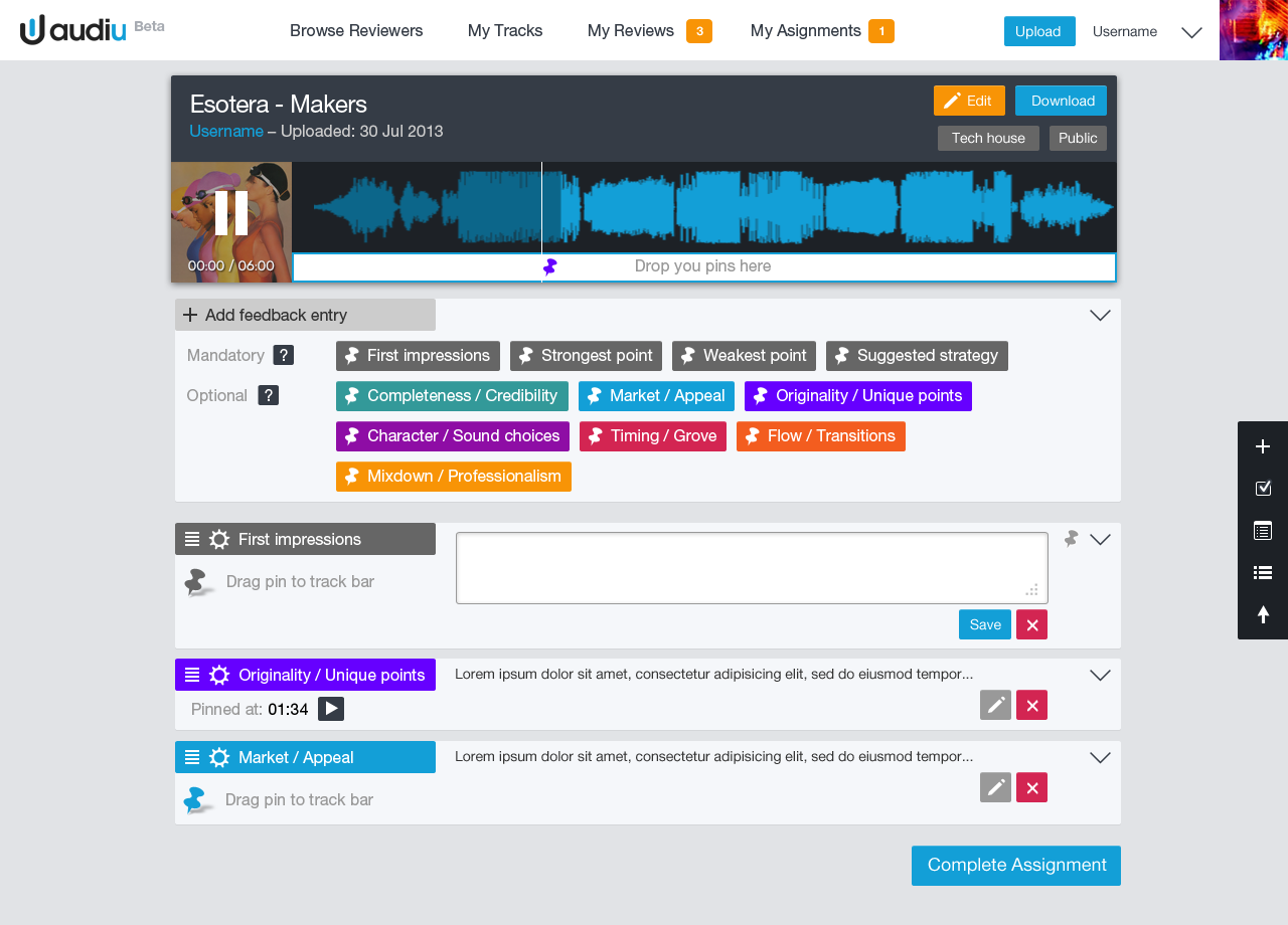
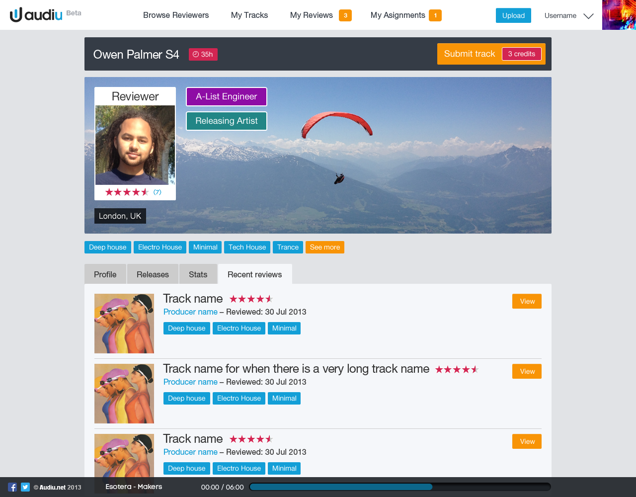
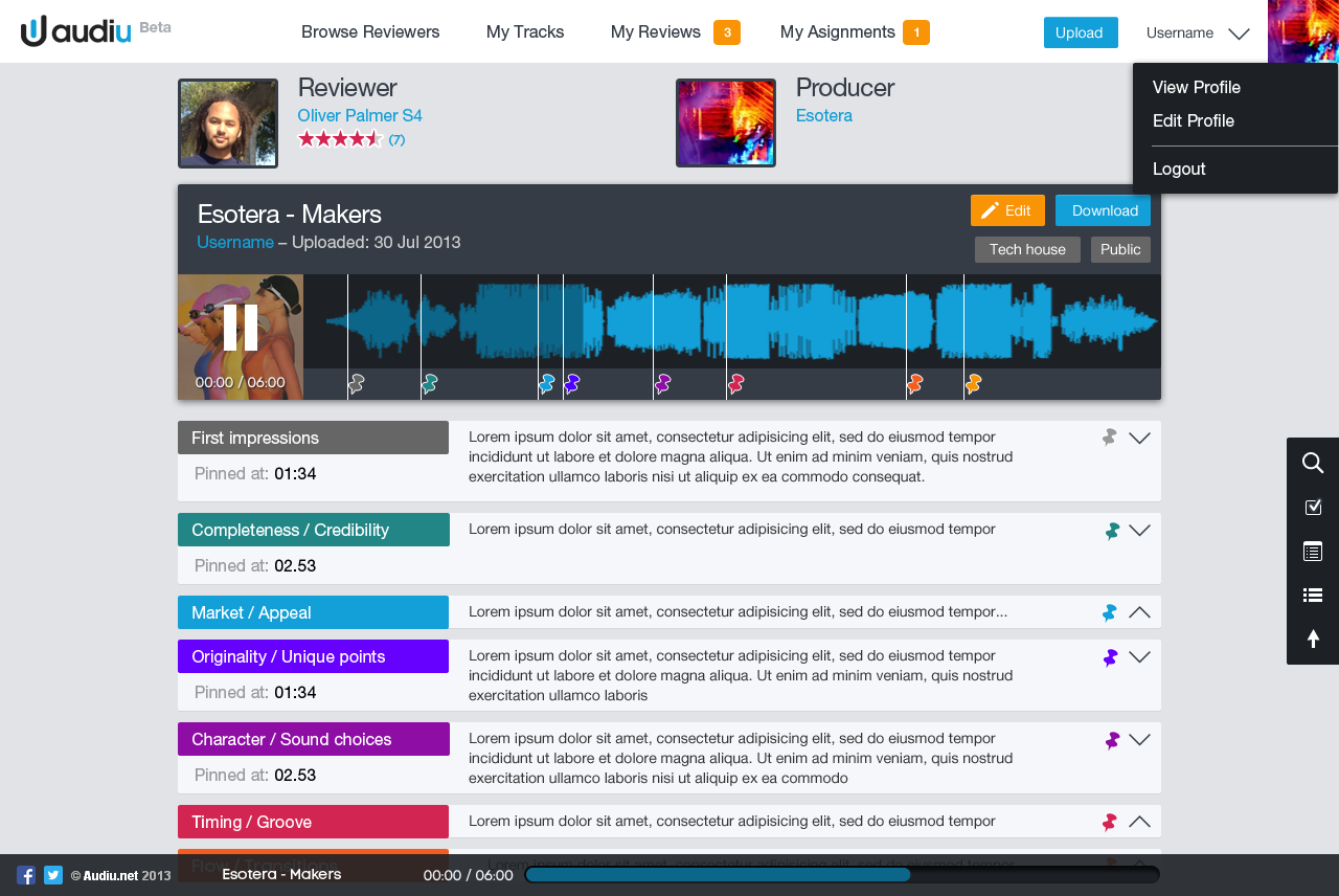
I helped the Audiu guys with a new user interface design for their music service that pairs music producers with professional reviewers to get feedback and advice on how to improve their tracks. Take a look at the Audiu Beta site here
For services that work across multiple platforms it’s important to keep a consistent style across UI elements. Various platforms and operating systems have their own native UI elements, but you can still add brand characteristics. At the end of each project I put together a grid of all the UI elements, as a quick reference for any future project. There is also a master UI matrix comparing elements across platforms, i.e. how does a play icon look on iOS compared to Android, and can it still reflect the brand?

iOS GUI schema

Desktop version schema

![]()

“We don’t have the time for psychological romance”
– Larry Blackmon, Cameo
As my missus will testify, I’m not very romantic and greetings cards make me nauseous. So I wasn’t looking forward to designing a feature for Valentine’s Day.
Then I realised it might be interesting to use music data to see if anyone else felt the same or if Valentine’s day was full of hopeless romantics playing “Somebody To Love” by Jefferson Airplane back-to-back like saps.
So I went to see Omar…
I don’t pretend to understand what Omar does, I like to think his job involves “running things through the computer”. He is always very patient with me, even when I ask him silly questions like: “Do you think David Hasselhoff’s audience was affected by the drunken cheeseburger + floor-as-plate incident?” (it did, the Hoff gained an extra 400 scrobbles that week). Omar was more than happy to dig into the Valentine’s Day stats, especially when I said I wanted to compare the music tags “romantic” with “sex”. I’m always running the word “sex” through the computer and it never takes long.
To get a clean set of Valentine’s data to analyse, Omar compared the listening behaviour on 14 Feb over a number of years to the behaviour on any other day of the year, normalised it to remove erroneous “new release” spikes, thereby sifting out the tracks unique to Valentine’s Day. Then we went to work with the location and genre tags.
This gave us a list of cities ranked from Sexy to Romantic and the proportion of sexiness for each.
Looks like I need to head to Fresno on 14 Feb!
")
Every year at this time, most music sites give you a run down on the best acts of the year. Generally, sites start rolling out “Best of” features in December, however at Last.fm we decided to wait until January so that we can show a complete year’s worth of data. This year we’ve also added a datavis feature, which shows key Last.fm stats, including the music news events of the year that made a noticeable change in an artist’s listening levels – or scrobbles.
To create this, we polled our colleagues across the CBS Interactive group for what they felt were the key music events of the year. I then used our internal trends tool to see if the artists featured in these events had any corresponding spikes in their listening data, based on actual total daily scrobbles. To my surprise, most of the shortlisted news events had encouraged listening, showing clear spikes. The only HUGE event that hadn’t really had any effect on listening was David Hasselhoff’s birthday. The Hoff is the Last.fm mascot and his birthday is always big news here in Old Street, but sadly not with the wider world. However he did have some huge spikes in 2011, which a quick check on Wikipedia proved to be related to a come back tour in Germany and Austria, who also have great taste in idols.
The Steve Jobs tribute was the last one to go in. I wanted to do a tribute to Steve (mostly because I am addicted to my iPhone and iPad), but mostly due to his huge impact on the world of music. The trouble is he’s not an actual artist (or so I thought), so he doesn’t have listeners to create a graph from. Instead, I used our site statistics to show how Apple devices are represented in Last.fm visitor levels. It was only later that I learned Steve Job DOES have an artist page, as many of his keynote speeches and addresses have been shared as audio files and podcasts, which do actually “scrobble” … and yes, there was a spike after his death in October.

")
Last.fm is a global company and provides translations in 10 languages. Translation is usually added into the html, but as the datavis was a graphic, yours truly had to edit the translations by hand, which was fun, as not all the character sets would work in the cut of Helvetica Neue I had. Also, sentence length in translations can be a huge layout issue, especially if tabs are used. In this case the annotation of the charts took up a lot of room and needed to be considered early on. Contrary to popular belief German wasn’t the most problematic in terms of sentence length; Russian caused the most formatting problems, followed closely by Polish.
 translated into Japanese")

I’ve been working on a refresh of the “Charts” section of the Last.fm site, including a new filtering options for “Hype”, “Top Artists” and “Top Loved Track”. This first launch only includes filtering by date, a later release will include “genre” and “location” filters, so that you’ll be able to can see the best “electronic” music or “black death metal” in your home town. Have a play at last.fm


Brief: Conceptualise and a music discovery app for WebOS. Timeline: 1-2 weeks.
Concepts, wireframes and visual design for a Last.fm music discovery app. Currently without a stable home (As of 18 Aug).


Wireframes below – the notes have ben removed (so I don’t have to worry about too many typos out in the wild ; ) !

Cold start experience – a way for new users to quickly add artists to their library

Exploring artists and recommendations

Exploring artist’s biography, images and top tracks

Playing personalised radio with slide show and listening stats overlay

GUI doc

Initial sketches of the interaction model


A tribute to the No 38 Routemaster


Omnibot 2000 by Tomy Robotics

![]()
Last.fm Festivals app won a 2012 W3 Silver Award for the Music & Audio Mobile App category and a 2012 Mobile WebAward from the Web Marketing Association. You can download the app on iTunes here.


My part in the project was to: create a set of wireframes, work out the userflows, provide UI and marketing assets, and follow up with QA and bug testing.
Read more about it on the Last.fm blog
With the addition of their new Festivals app, 5 years of Last.fm data just became even more useful for me bit.ly/ettmpZ – @MattHurst
Last.fm Launches Amazing New Festivals App — t.co/egA2wjr #music – @Acecentric
Awesome new #lastfm smartphone application recommends music festivals according to your musical preferences t.co/EcleOJF – @Florianmaganza
Last.fm aims to making choosing which to attend easier with its new Festival application – Mashable
![]()

A new logo for catering brand “Easy Gourmet” for their new deli counter opening soon in Balham, South London.
![]()

Easy Gourmet Catering’s new CMS site is live. I designed and developed the site, as well as creating a new logo and brand. Still some holes in the content, but it’s good to get it live to let Google start indexing.
I started what I though would be the slow process of switching the DNS with the current host (the mammothlyg expensive Netbenefit) only to find things happened super quick. Then had to migrate 8 pop email accounts and set up the necessary forwarding the client was using – which meant learning how to migrate pop email FAST! Always a good way to learn 😉
The design and build of the site took 2 months and was completed in January, however putting the content has taken much longer. Easy Gourmet had great help from my friend Michael, who is an excellent editor and travel writer. However, this kind of content is quite personal to the business and needed a lot of involvement and consultation with the client, Marie, and running a successful catering company keeps her very busy.
The most exciting part of this project is the SEO opportunity. The old site was poorly structured and not at all optimised. I did an audit of the 40 most likely customer search queries in Google for page rank (e.g. Wedding caterer”, “Catering London”, “wedding reception catering”). I found only the exact company name “Easy Gourmet Catering” returned a page 1 listing, and that was compromised by a competitor with a similar name in the second position. For all the other search terms there was no listing at all. The new CMS structure and some basic copy alone should give this site a decent presence in search results, but with Michael’s rich copy and some “white hat” optimisation tricks of mine, I think this site will start to be SEO competitive. Google generally takes between 7-14 days to re-index a change on a site; there is an unconfirmed theory that Google is slow to react because it “sandboxes” changes.
Easy Gourmet Catering is a successful business now, even without the aid of natural search listings, woth this new site it should explode! If, that is, people really choose caterers from the web, or if it’s more of a word-of-mouth reputation based business.

![]()
![]()
![]()
Based on existing illustration work from the excellent Rehab for the Best of 2010 site, this icon will be the new face of a desktop player app. I took the more anatomical heart drawing and simplified it, then added the woofer and tweeters for play-your-music-love-metaphor-iconess.

Second iteration ideas for my Graeme Balfour, who needs a unified personal/professional identity and website design. The gesturecons from the first iteration are still planned, but the more urgent issue is to get the web presence sorted.

I love a challenge ; )
These are sketches for a professional identity for a friend who has a very diverse skill-set: massage therapist, yoga teacher and usability consultant.
The easy route would be to treat each strand separately. But that’s no fun. There was already a nice idea of using hands as a conceptual image for the massage, the leap was to tie that into “interaction and usabilty”… oh and “Yoga”.
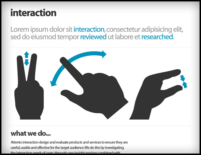
As often happens, there was a bit of serendipity: earlier that week a colleague had introduced me to a really nice set of “gesturecons” (illustrations used in diagrams to demonstrate how to use software on touc-screen devices) for a user-flow diagram I was doing. Massage is about touch, so why not use gesturecons to illustrate massage movements?
Trying to tie this concept into yoga was a but more work. Then I remembered that in yoga books you often have figurative diagrams to demonstrate postures, and in yoga there are postures just for the hands, called “mudras”.
It seemed to fit quite nicely as an idea, hands that massage, a hand in a meditative mudra, and a hand performing an interactive gesture.

I’ve designed some labels my friend Shalineee to go with her home-cooked chutneys and mulled wine.

When I first designed the Books With Bite site Hachette didn’t have a logo ready, so I quickly mocked one up (below) and they were happy to keep it. Now the in-house team have a new logo, made from one of the cover illustrations and the house fonts Goudy Old Style and some other funky distressed font called “Beach”. The new logo fits the site really well and still has dripping blood to fill the “glass vial” nav panel, though I think my treatment was more sublte ; )


In the photograph I was using to draw this logo, which represents the decoration made from a drop of cream in a fruit coulis, it looked like a leaf. They are in fact hearts. So I have updated my Illustrator rendering for this logo mark. The shape is more feminine now and will compliment the image of the (still secret) company and it’s owners. Original design is below.


“The social buttefly”. OK, it wasn’t my idea.
Logo illustration to be used as a brand element and to spice up the UI of “My Time Out”. Drawn in Illustrator, the outline was a tracing and the markings were hand drawn. Lovely, lovely bezier fun.
Someone walking past my desk while I was drawing this commented “your job is so much fun”. I guess you take it for granted after 15 years, but it’s no bad thing to spend an hour being paid to draw a butterfly.

Work is progressing on the build of the Books With Bite site, a site for Hachette Publishing to increase engagement with their range of “Supernatural romance ” titles. The site will be based on Joomla to offer the client to manage and update the site.
I’ve designed the site and created the logo, the Joomla build is being handled by Lurex Lounge. The deadline is Halloween!