Freelance Apple Watch app designer – needs an Apple Watch!

Apple Watch app designer

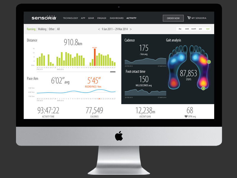
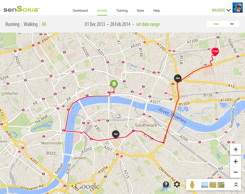
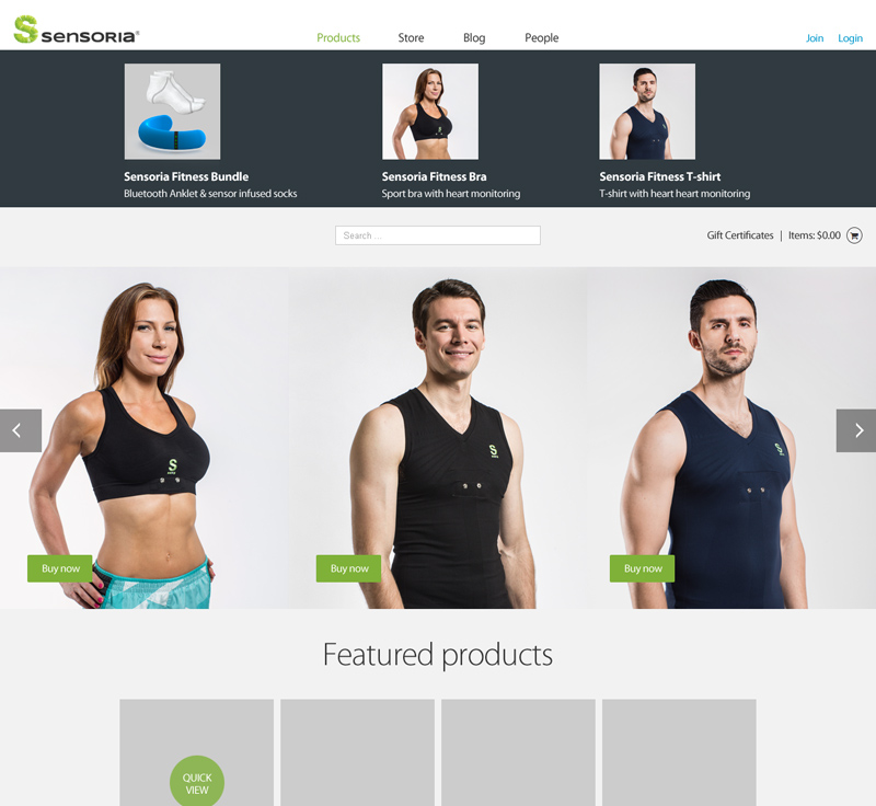
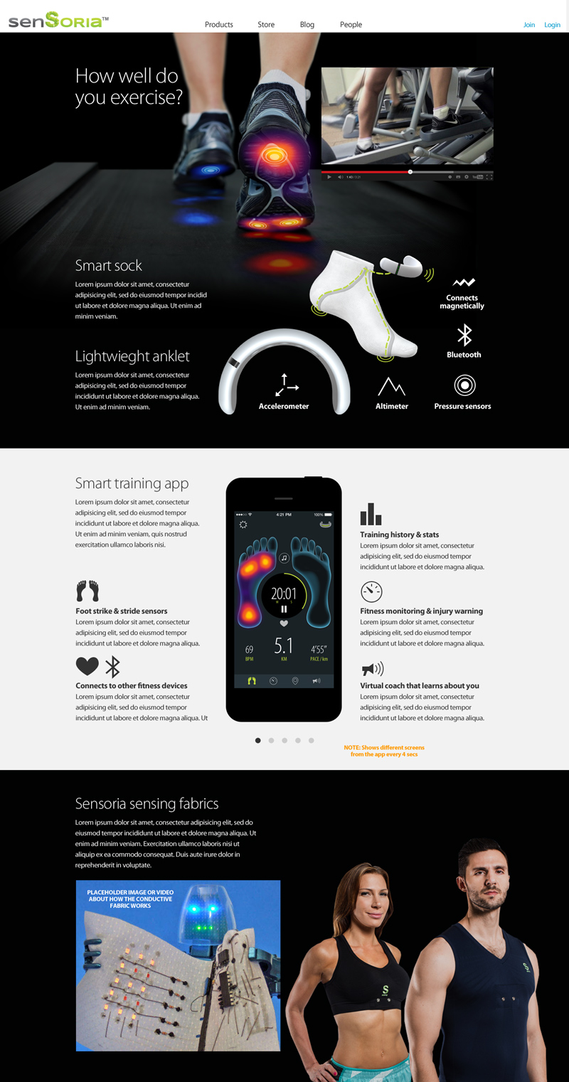
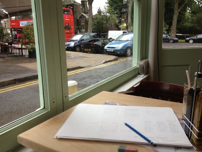
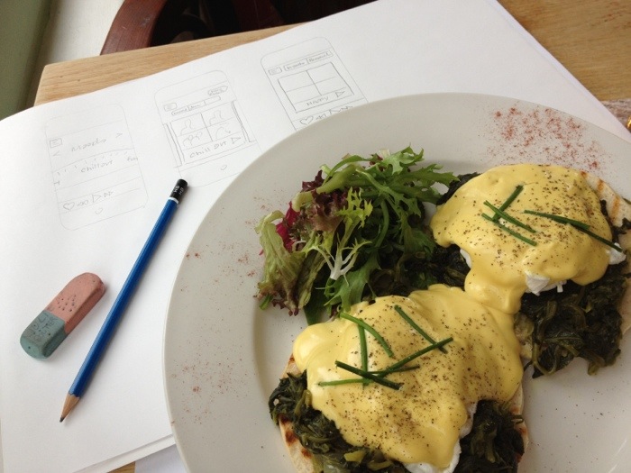
Here are some early concept designs for an Apple Watch fitness app. My chums at Sensoria asked me to photoshop some concepts to show how the Apple Watch could work with the Sensoria fitness wearable device. The Sensoria smart socks have sensors woven into the fabric which can detect strike points on your feet as you run to help you improve your running technique. Sensoria are one of the leading developers of truly wearable technology and the “internet of things”.

Designing an app for the Apple Watch

Designing for the small screen and “quick glance” use case of the Apple Watch is a largely reductive process, editing the parent app down to the most essential features, then refining the graphics so they are legible on the small screen and the context of a quick glance.

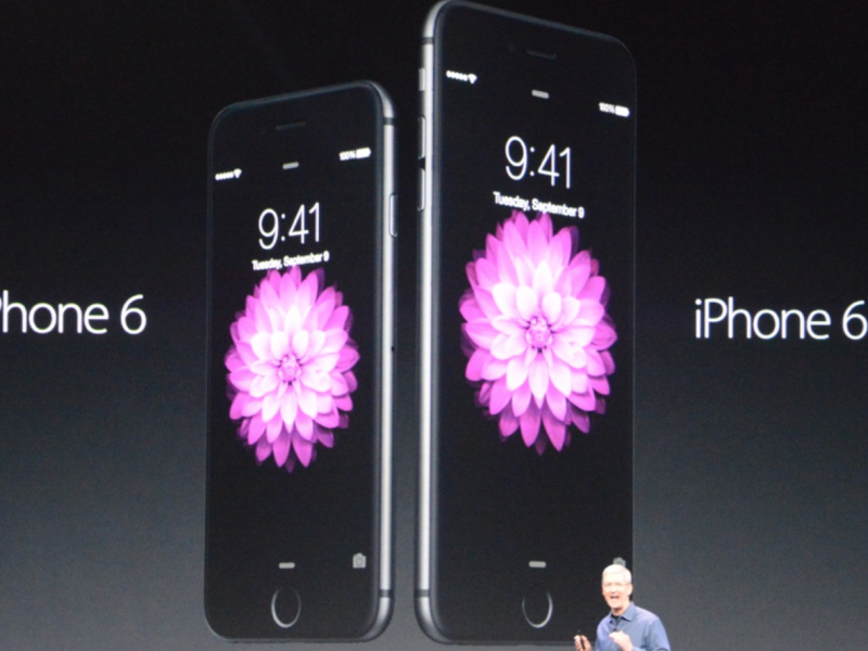
Of course, all this is academic for me right now… I need an Apple Watch! Which means I also need a new iPhone 6. I’m not someone who likes to upgrade for the sake of getting the latest thing.  I’m convinced Apple have been sending “slow-down-self-desctruct” messages to my trusty iPhone 4s – it use to be lightning fast 😉

I’m trying not to listen to that inner voice that says:

You are a Freelance Apple Watch App Designer… you need this for your freelance designer business

Wedding photographer logo and branding

This geometric pattern, formed by the facets of a diamond, represents “clarity”, “quality”, and “ever lasting”. The use of a geometric form reflects the precision and craft of photography.

logo-03-card-black
Embossed business card and a paper design I found online

3-print-envelop
Die-cut print folder

3-stamp
Rubber stamp to add a hallmark to prints

logo-03-usb
USB box

logo-03-card
Altermate business card embossed on white

logo-03-wax-seal
Wax seal

logo-03-card-black-alt
Alt font

How to design new iPhone 6 Plus images resolutions in Photoshop

Designing for iPhone 6 screen resolution and dimension

Compared to Android, designing screens and creating assets for iPhone use to be easy. For a ling time we’ve only had to deal with two densities, and only 2 screen dimensions. The iPhone 6 Plus introduces a new screen dimension and a new HD screen. It’s a fairly typical 1920 x 1080 format, once popular with LCD TVs. This post is a place for me to log all the new sizes, and also to compare the require assets against Android’s require set of densities. The strange this is, for the iPhone 6 Plus, the graphics have to be provided much larger than the 1920 x 1080px screen resolution, as they are set at x3 standard resolution and then scaled down to fit the hardware.

iPhone 6 Plus screen size / dimensions

  • iPhone 3 – 480 x 320px
  • iPhone 4(s) – 960 x 640px
  • iPhone 5(s) – 1136 x 640px
  • iPhone 6 – 1334 x 750px
  • iPhone 6+ – 1920 x 1080px (scaled down from 2208 x 1242px)

iPhone 6 plus launch image resolution dimensions

  • iPhone 4 launch images: 640 x 960px
  • iPhone 5 launch images: 640 x 1136px
  • iPhone 6+ launch images: 1242 x 2208px and 2208 x 1242px (the iPhone scales this down)

iPhone 6 plus Retina HD image resolution densities Vs Android density pixels

  • iPhone 3 / Android MDPI | 100% | 1x
  • iPhone 4, 5, 6 Retina / Android XHDPI | 200% | @2x
  • iPhone 6+ Retina HD / Android XXHDPI | 300% | @3x

Some devices scale as well

Android and iOS makes it easy to create different resolutions by requiring graphics at easy scales x2, x3, x4, but manufacturers make screens to fit the design of their devices and x2, and x3 does always fit what they want. Therefore, some devices artificially scale the resolution up or down, for instance the new iPhone 6 Plus requires x3 graphics, but only has a 1080 x 1920. However, the graphics you supply to the developer still need to be x3 size for Android.

This is fine for icons, but is an issue if you’re providing full screen images as the aspect ratio may be different.

See my guide for How to start designing Android apps in Photoshop & what is a dp?

Electronic music site logo – 3rd iteration

In the second iteration I was asked to try a more minimal logo based around the “J”. We also had a font we really liked called Chalet London 1970 by House Industries.

The client liked the last two ideas, a combination of the clean J shape with a bit of movement.

After some thought, the client decided they actually quite like the rotated “J” logo, an wanted to see some development on that version with colour option. Nearly there. Replaced the funky Chalet “S” with a customised “S” from Lucida.

JustGo Music logo colour samples

Last.fm infographic A2 poster

Last.fm Best of 2011 - Year in Music infographic - datavis

I was pleased to get a surprise present from my work-fellow @baseonmars… It’s the Last.fm “Best of 2011” infographic as an A2 poster, with a gorgeous matt finish. Thank you! He wanted a framed one for his wall at home and got me a copy… because he is awesome.

Rebecca Black goes viral - 11 Mar - "Friday" goes viral and is dubed "the worst song ever"

To get this to work in two columns on A2 format I had to add an extra scrobble graph not seen on the original Year in Music freature: Rebecca Black goes viral: 11 Mar – “Friday” goes viral and is dubed “the worst song ever”.

GUI matrix – consistency of brand assets on different platforms

In an effort to maintain consistency and quality of our application icons, I have been collating a GUI (Graphical user interface) reference doc. As we produce applications on different devices and platforms, we need to take native UI styles and features into account. Although there can be no “generic” iconon all platforms, we can still achieve a consistency of drawing shape and general ‘character’ of icons across apps. For instance: to create tab and activity icons in iOS you  provide white shapes on transparent backgrounds, the “blue gloss” styling is added dynamically within the app.

This matrix is more of “how are we doing” document to see if Last.fm style shines through the veneer of native UI styling. The grid shows platforms in columns (names removed for confidentiality of work in progress) and the rows display the various activity states: rest, hover, press)

Re-discovered Gormenghast sketch by Mervyn Peake

Abiatha Swelter, Chief Chef of Gormenghast" pen and ink sketch, signed "Mervyn Peake '47"

A newly discovered re-surfaced (!) sketch by Mervyn Peake came up for sale this weekend in an exhibition at “The First Tuesday Society” gallery in Hackney to mark the centenery of the author’s birth. The pen and ink sketch, sent as a gift in a letter to friend of Mervyn Peake, is of “Abiatha Swelter, the Chief Chef of Gormenghast”, a charcter in Peake’s “Titus Groan” saga. The sketch was part of a vast collection offered for sale by Peake collector and rare book dealer Mike Kemp.

I’ve been a Peake fan for 20 years and have helped out on the Peake website on and off for 10 years and I had never heard of this sketch, but Peake biographer and scholar Peter Winnington informs me that it’s been in Peake Studies before. Which goes to show that a 20 year obsession only gives you only a glimmer of knowledge of such a prolific talent.

So Peter… did Peake ever draw a detailed picture of Gormenghast itself? That would really be news.

An excerpt from “Titus Groan”: Swelter in the great kitchen.

New reception wall art at Last.fm HQ

Last.fm reception mural - illustration by Rehab Studio

The artist who pianted this mural was using an old transparency projector to trace the art, so I needed to give him a clean line-art version of the original vector file. I also helped to slecet the colours. Although there was some initial confusion as he wasn’t given a definitive pantone…

There are actualy 3 reds in use across various mediums: Pantone 1797 & 1087 and Hex #d51007.

To keep things simple, and as the mural looks great in th sun… I’m now claiming Rectory Red is the official colour. Anyone who wants a swatch has to go and chip a bit off the wall.

Sketches for a new identity…


I love a challenge ; )

These are sketches for a professional identity for a friend who has a very diverse skill-set: massage therapist, yoga teacher and usability consultant.

The easy route would be to treat each strand separately. But that’s no fun. There was already a nice idea of using hands as a conceptual image for the massage, the leap was to tie that into “interaction and usabilty”… oh and “Yoga”.

As often happens, there was a bit of serendipity: earlier that week a colleague had introduced me to a really nice set of “gesturecons” (illustrations used in diagrams to demonstrate how to use software on touc-screen devices) for a user-flow diagram I was doing. Massage is about touch, so why not use gesturecons to illustrate massage movements?

Trying to tie this concept into yoga was a but more work. Then I remembered that in yoga books you often have figurative diagrams to demonstrate postures, and in yoga there are postures just for the hands, called “mudras”.

It seemed to fit quite nicely as an idea, hands that massage, a hand in a meditative mudra, and a hand performing an interactive gesture.

www.bookswithbite.co.uk new logo

Books With Bite Logo
Books With Bite new logo

When I first designed the Books With Bite site Hachette didn’t have a logo ready, so I quickly mocked one up (below) and they were happy to keep it. Now the in-house team have a new logo, made from one of the cover illustrations and the house fonts  Goudy Old Style and some other funky distressed font called “Beach”. The new logo fits the site really well and still has dripping blood to fill the “glass vial” nav panel, though I think my treatment was more sublte ; )

Books with Bite logo
Books with Bite initial, temporary logo

Facestalking – My Time Out

My Time Out

Above: Attendees to the Gauguin exhibition Vs Urban Nerd’s Halloween club night.

Time Out’s Facebook integration is starting to gain momentum and events are starting to get good “attendance” numbers on the site. It’s interesting to be able to compare the audiences for differing events, as well as to see the real faces of Time Out visitors for the first time (Previous Facebook “fan pages” didn’t really represent engaged, event going, users).

Note the picture of Christopher Walken, 3rd pic top row. Sin-Jin Smyth is the team’s test profile. A nice reference to the final Moore Bond Film “A View to a Kill”, which is a camp masterpiece and a great Bond film, dispite Roger’s advancing years.