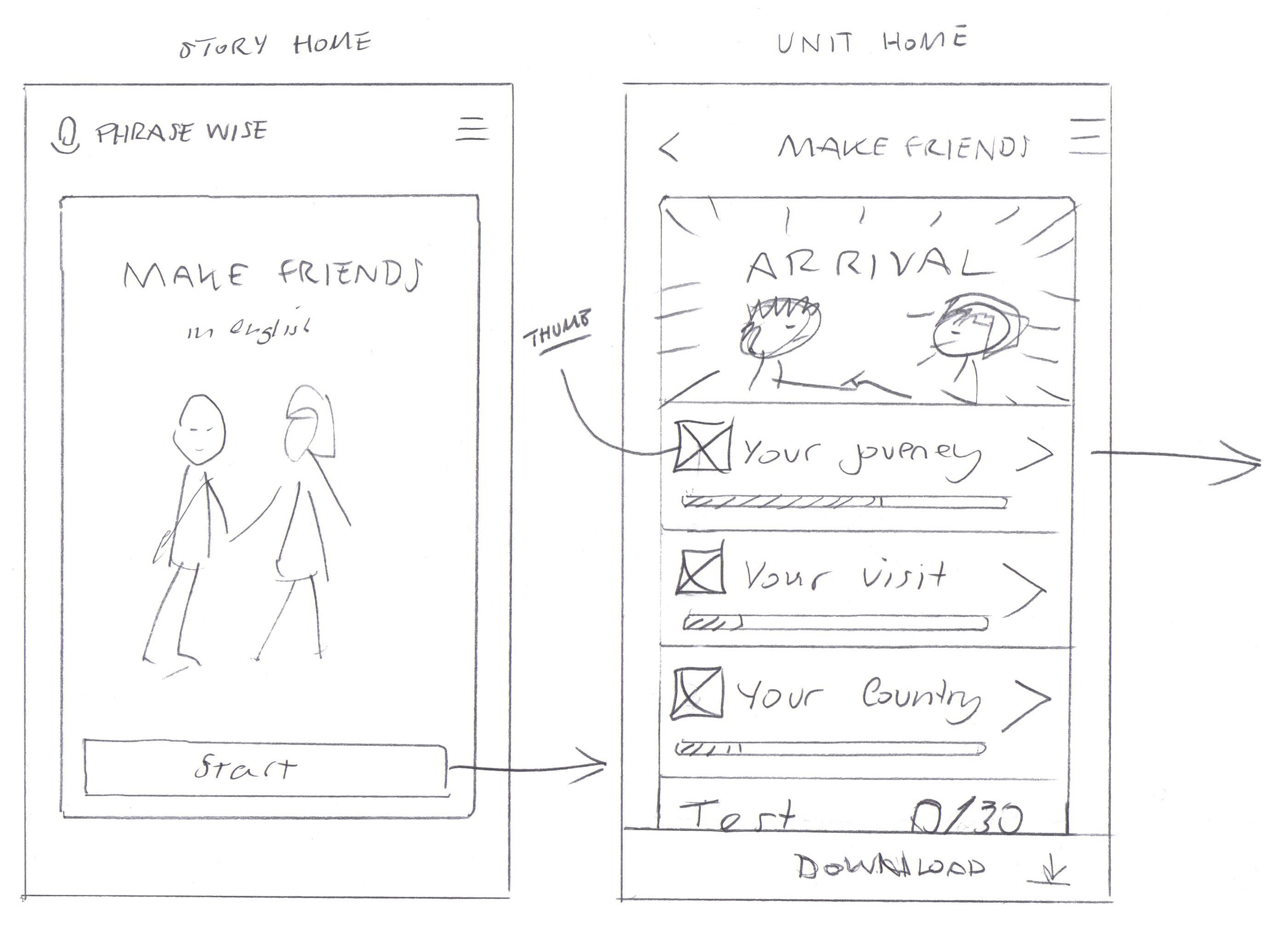
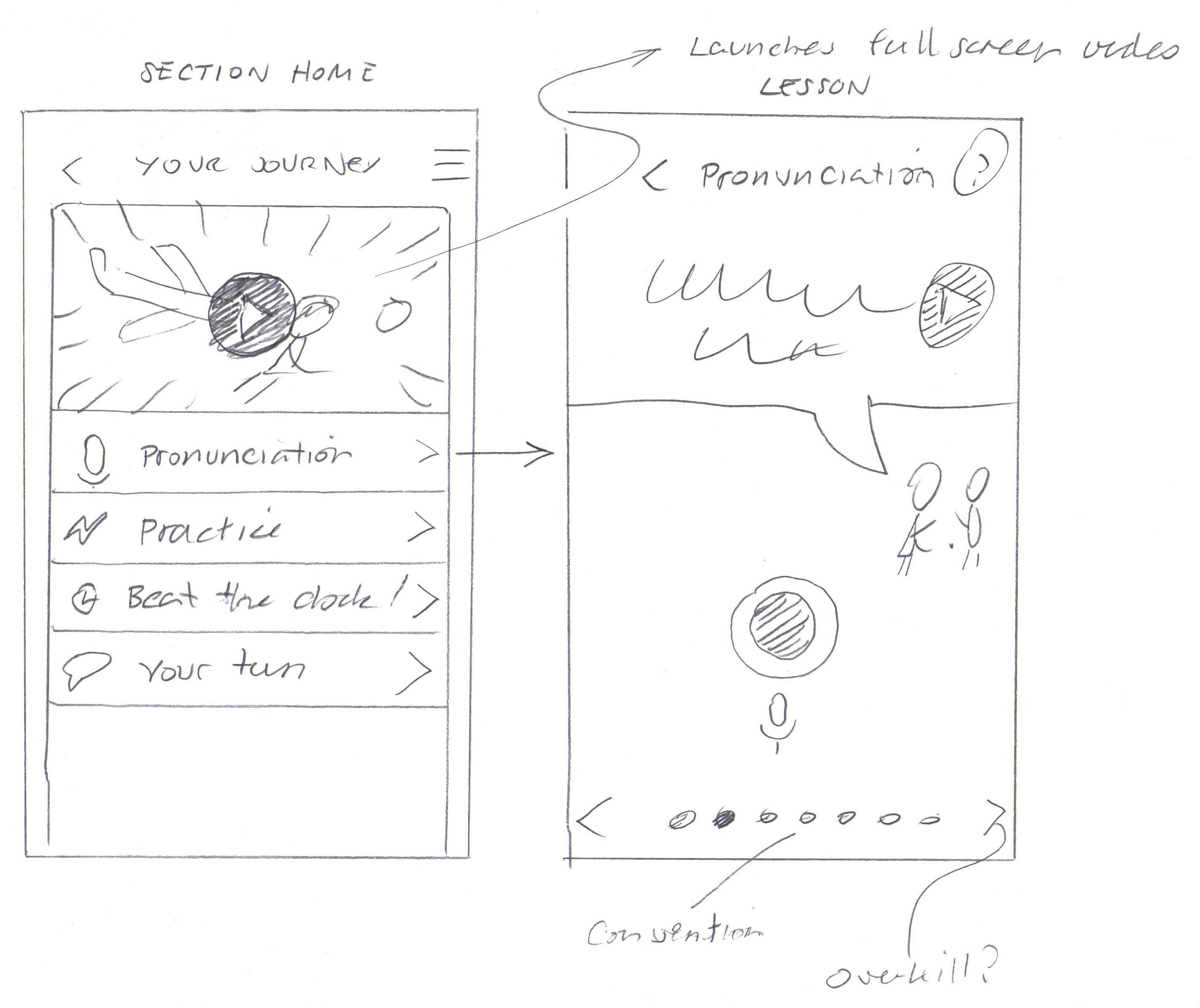
I was asked to do a UX review and help steer the design of Phrasewise, an English learning app. The app was already working well and looking really nice, but had some inconsistencies in the UI metaphor and was lacking the warmth and personality of the character animations that were the main feature of the app.
I ended up tweaking and re-drawing most of the app to give the styling a consistent voice. Some of the more novel interface concepts, which testing had shown were a bit too trixy, were replaced with more standard UI that users would be familiar with from native apps.
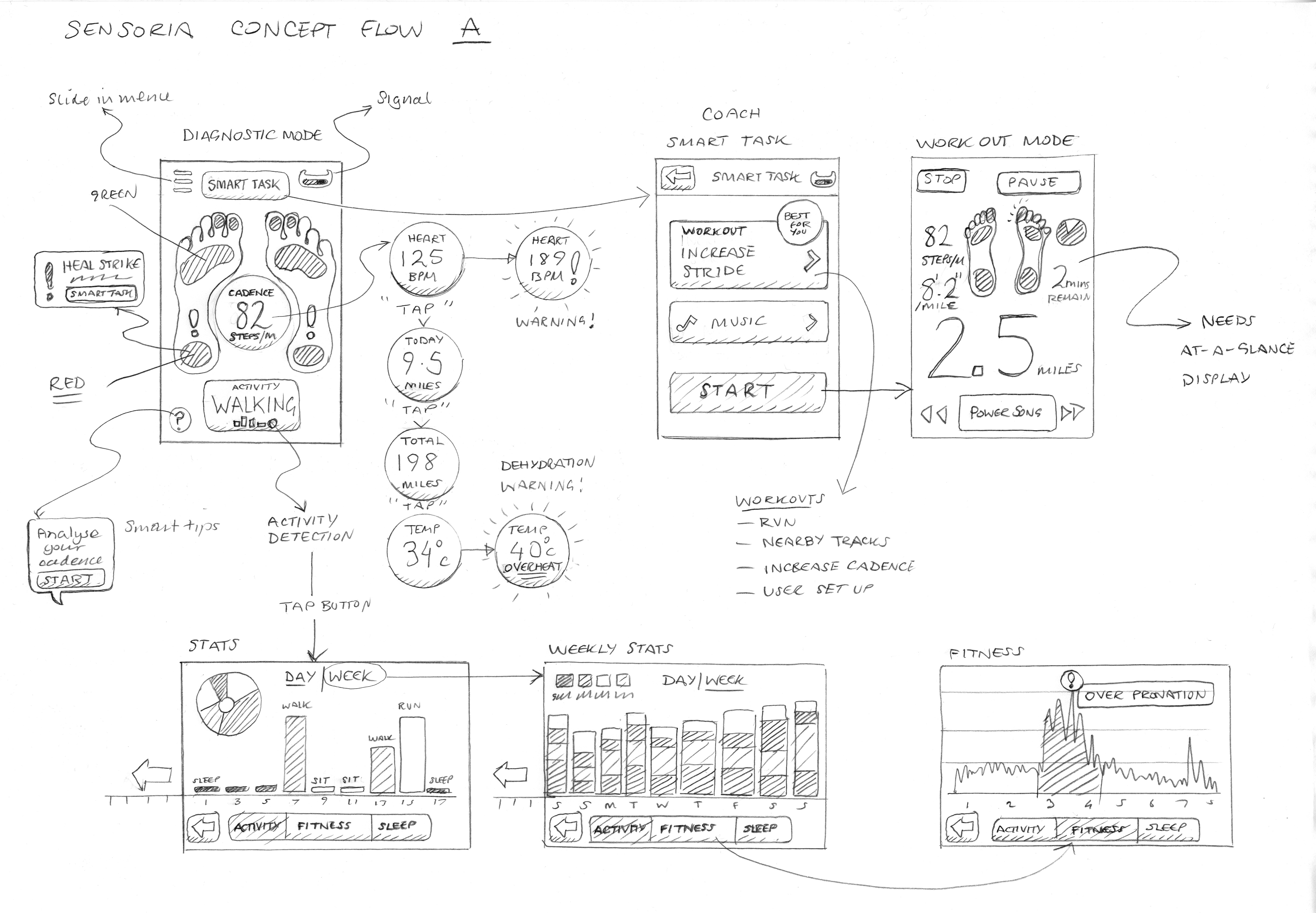
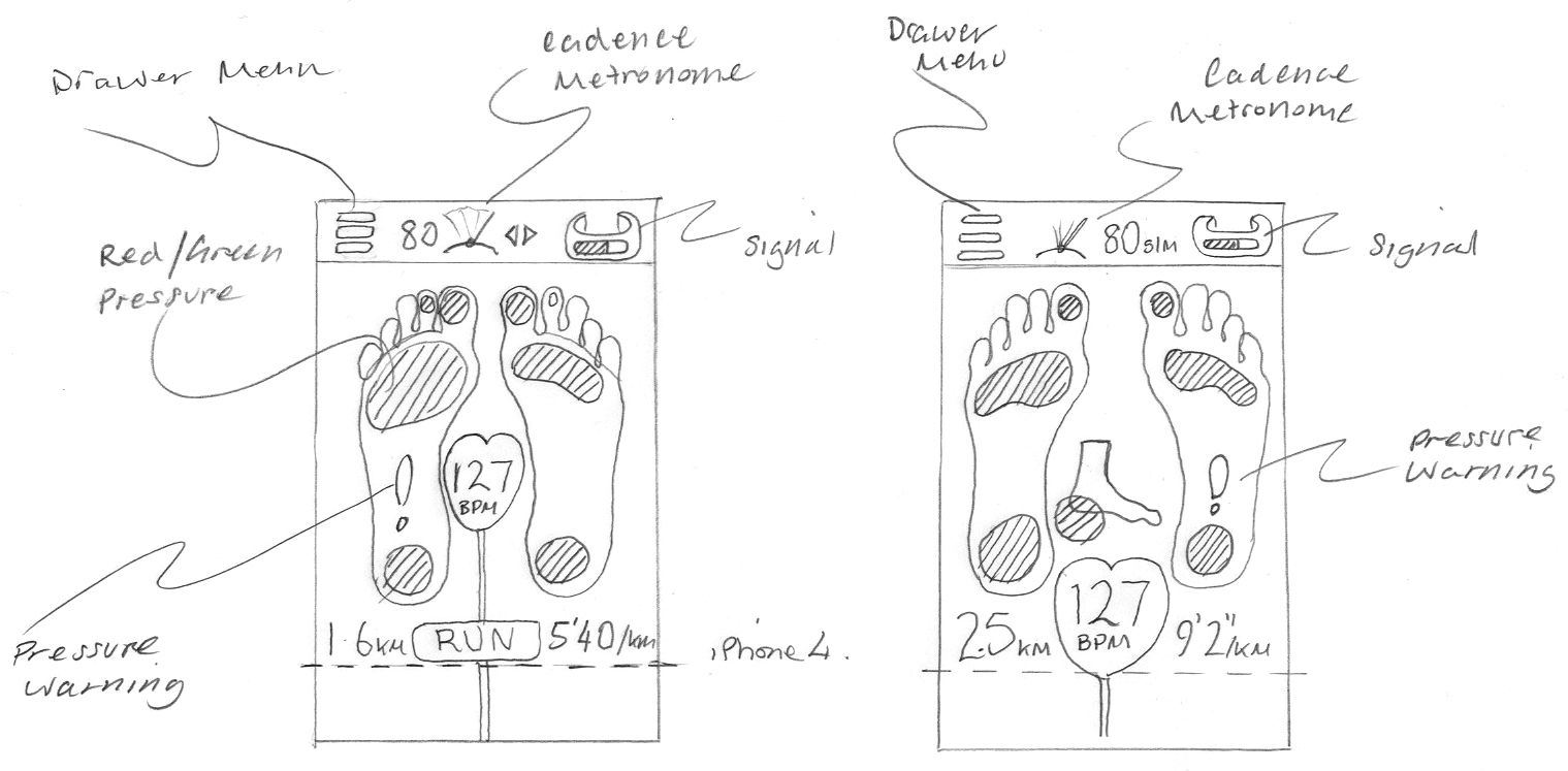
I’m very excited to be working with Heapsylon on an iPhone app for their amazing Sensoria, a super accurate fitness tracker that connects your iPhone to a smart sock and sensor that tells you how well you run. Wearable technology and smart fabrics are a fascinating new form factor, and as a runner I’m very keen to get hold of a prototype as soon as I can. Click here to pre-order yours.
Sketches for the “logged out” homepage of Last.fm. The purpose of the page is: to introduce the service, encourgae signup, and offer a taster of the content. In these initial sketches I was exploring the idea of focusing the page on the different use cases: listening to radio, scrobbling listening history, and music recommendations.
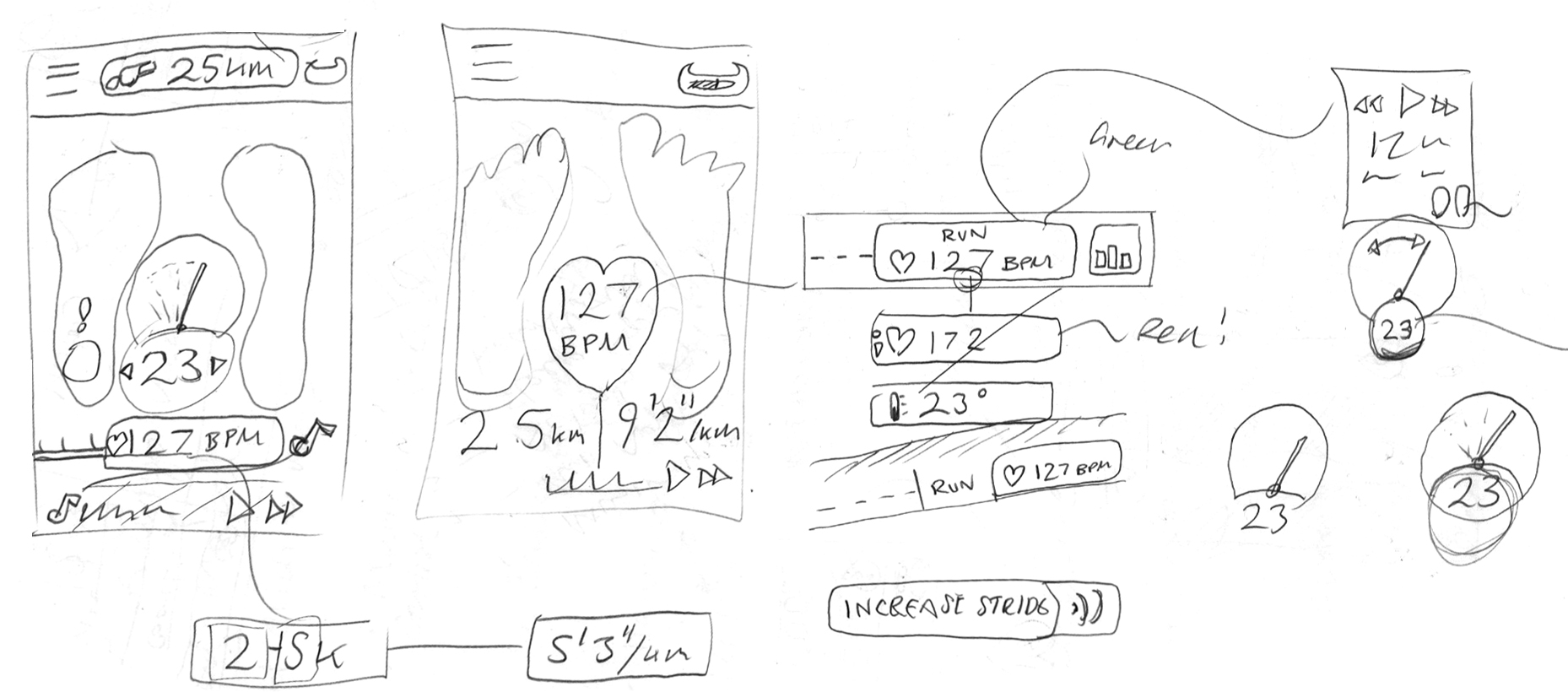
Here are some sketches on an iOS app I’m currently working on, laying out possible ways to interact with your local music collection using listening data.
This first sketch was a quick pass of how to lay the app out using floating frames, before I moved onto simpler and more interesting interactions.
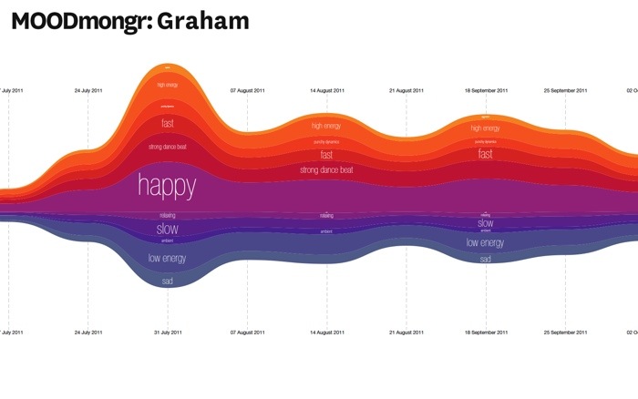
Sketch for an idea for a hack day at Last.fm. The theme is “user profiles”. I’m working on a project with Mark Levy, who leads the Music Information Retrieval team, to chart the mood of a user’s listening over time using new audio analysis tagging. We will be testing it on the team first!
I call it MOODmongr
The results
In general, the moods were pretty even across the year’s listening of my test group; my team mates. This was largely due to the fact that we all have varied music tastes and use radio steams and playlists for variety. However there were a few spikes and points of interest:
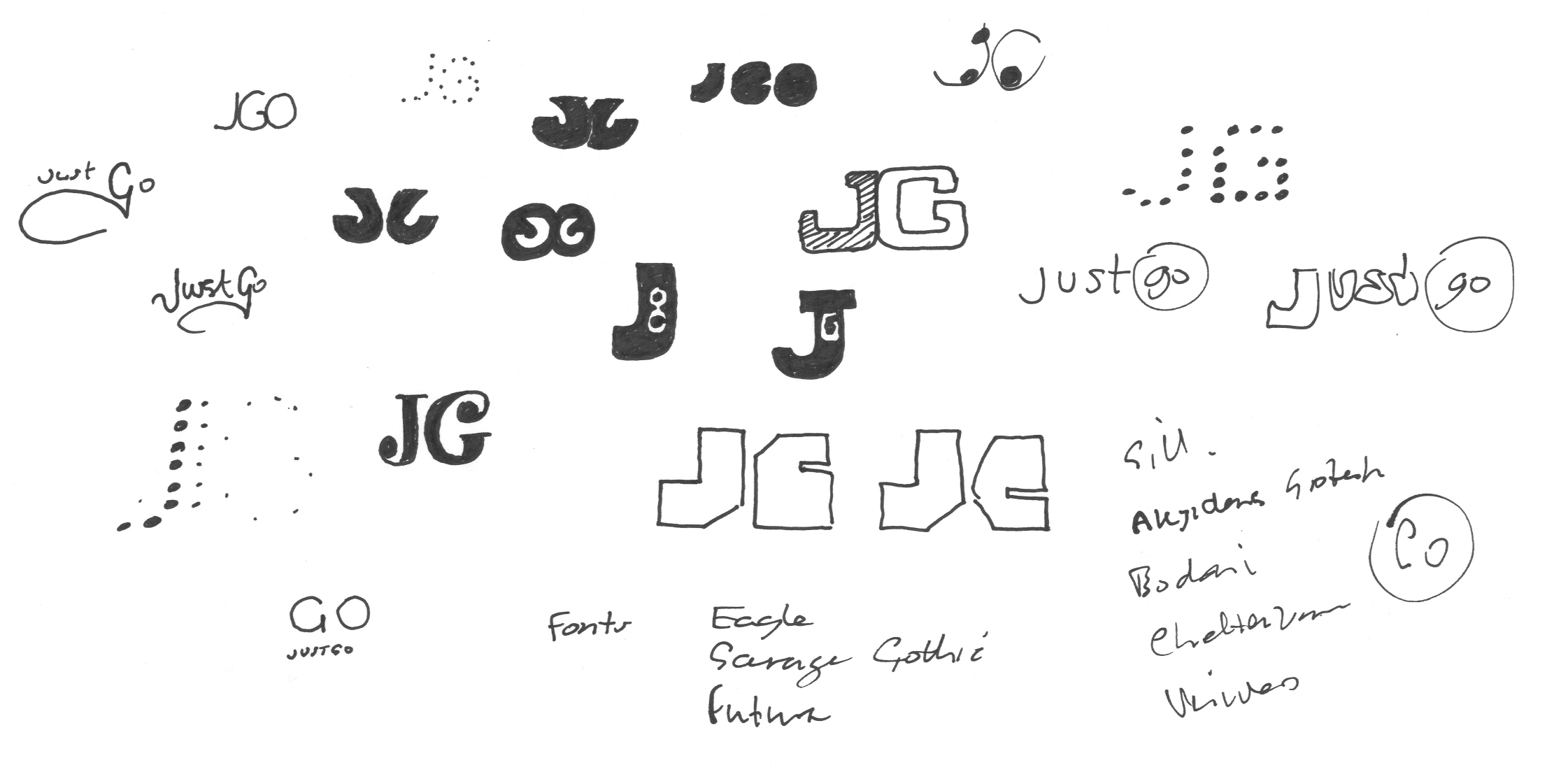
I’ve been working on the branding of a new product creating a social space for the electronic dance music scene.
The current logo is the old "grpahic equaliser" - I developed that into a more abstract waveform, that then started to look look like the cut-out shape you see in a razor blade.
I have to get the whole DJ cliché out of the way. It was nice that the "J" could be worked into the arm of the deck.
Morphological matrix
After doing some research into the scene and some broad thinking on possible themes that might add personality to the brand, I start to sketch ideas using a “morphological matrix” as a way of organising the ideas, it also helps to make those lateral connections. Here’s the matrix as a whole…
My initial idea for the infographic was based around a map, however when the data was ready it turned out the festivals at the top of the list were mostly in the UK and Belgium.
In my last few months at Time Out I was asked to create some concepts for a Time Out London iPad app. The designs were intended as a discussion point for possible commercial opportunities such as advertising and paid-for content, but also to have something visual to get excited about.
Time Out are the best known for providing “What’s on” information for London to help people find something to do, but they also have strong editorial content on life in London, such as: opinion pieces, cultural commentary and reviews.
The brief I was given for this app concept was that it should feel like a magazine, but have a prominent search facility, however as started mapping out the use cases (below) I quickly came to the conclusion to that there should be a browsable magazine style app (this was a whole year before Newstand and Adobe’s iOS publishing tools), and a separate productivity app for finding things to do. In general, apps are best when they are focused on one purpose or solving one user goal, which makes for a simpler UI. For me, the use case of a productivity tool and a sit back and browse a magazine felt somewhat at odds with each other.
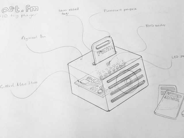
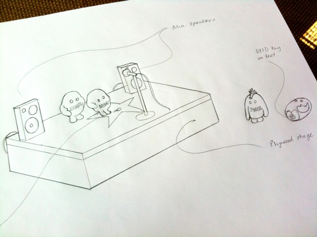
There are lots of boffins and whiz kids at Last.fm, and I’ve been task with conceptualising something they could make based on RFID tags for interacting with music data and streams. (RFIDs are little stickers with antennaes for use in contactless technology – like Oyster cards)
I’ve been sketch ideas for a fun way to change the genre of music on the reception radio stream using physical objects that have RFID stickers on them.
The first idea is for a stand-alone player using the guts of a Mac mini, stuffed in a box made of plywood, that has a slot in it for fluorescent perspex tag cards. Ram in the “pink” card and the box would light-up and the radio stream would switch to pure FUNK-FUNK. Other cards would be available… but only if you need something better than funk.
The other idea is to make little action figures based on the Last.fm “scrobblin” brand characters, with RFIDs on their feet that you place on a miniature stage containing the RFID reader. You could then make a mix stream by putting a number of scrobblin tags together to form a band, for instance: “electro emo funk rock”.
It’s very easy to get lost when designing an app, but when you’re designing for a touch-screen experience, with gestures replacing clicks and scrolling, it’s even more complicated. Touch-screens introduce physical concepts to help the user navigate: spatial planes that you can “swipe” across, representations of physical objects, and zooming in and out and content. This makes the user flow in and out of content very tricky.
Immersive Vs productivity apps
In a productivity app, like email, its better if a user can drill in and out of tasks in a straightforward way. Therefore the folder based metaphor of desktop operation systems makes sense. But for a more immersive experience where you want the user to get “lost” in the experience, you need a more “open’ and loose heirachy. In my experience, “Open” is very hard to develop… as it’s harder to anticipate all the possible routes and outcomes, so the UI presents consistent behavious where ever the user is.
In this example I’m looking at an immersive touch-screen way to explore music artists. A list of artists is presented as a photo grid (or quilt), and the user can zoom into the grid to look at an individual artist. They can then swipe left and right to see the next artist in the grid. This mixes two existing navigation metaphors: picture thumbnail gallery and a page-turn magazine experience. Phew.
But now the hard bit…
Every artist has similar, or related, artists. Daft Punk has: Justice, deadmau5, Digitalism, etc. We want to encourage the user to follow these connections and explore more artists freely, but at the same time, need to give them a clear way back to the start of the app.
Browsing music artists using touch gestures model 1
Model 1
The user zooms in on an artists, then when the click on a related artists, that opens another grid. In the programming model, each artist opens as a new level in the app, and each related artist grid is another level on top. Phew! The layers build and build, and for to get back to the start, do they have to press “back” through each of these layers?
Browsing music artists using touch gestures model 2
Model 2
The user can zoom in and out of the grid to see artists, but if they want to click on a related artists, that launches a new grid in a new session. To get back, the user goes from grid to grid. It’s more like a concept of islands of artists, than levels. This will be much easier to develop, as each time you press to see a set or related artists, you are clearing he grid before, much like performing a new search.
If this comes across as an incoherent ramble, it is because my mind has been broken by too long in front of the whiteboard!
Some random sketches, thinking about a way to visualise the tricky concept of scrobbling. These are based on new stuff floating around in my head mixed with exisiting ideas and metaphors. So far I have: clouds, “scrobblins” (my new name for the brand characters created by the Rehab Studio), hearts, headphones & stethoscopes.
Read the iOS Human Interface Guide lines
Apple know what they’re talking about, and it’s better to be inspired by built-in apps than by copying competitors. One word of warning though… don’t assume that all functionality in built-in apps is available in the SDK. It ain’t always! iOS Human Interface Guidelines
Write an “Application Definition Statement”
An ADS helps you to focus the app and keep it simple. You need to define the:
USP – what makes it a cut above the rest?
Purpose of the app
Who is the app for?
Then, if at any point you think of other features (or if some smart-alec starts pitching in), alwasy check it against the core purpose of the app, to make sure you’re not overcomplicating things and bloating the app.
Write a feature list
of all the things users might like. I brainstorm this through think-maps and work-flow diagrams to think through the various uses of this app, and the processes people use in the real world to achieve the same tasks. Compare the feature list against the ASD and focus the app to core features. Do I really need to offer offline browsing, when the core purpose is user is out and about and needs to look something up”.
Work out the key screens
Make quick paper prototypes to help think through different models and identify which key screens need designing to show a user through a task (or tasks).
Prototype
Create paper prototypes the most successful models to test with users. Alternatively, you can put your flat designs into the “Photos” app, to give users a more hands-on experience.
Test, iterate, and test again I prefer batches of 5-10 users. Keep iterating until every user is sailing through the tasks your app is designed to fulfill, and when you feel confident enough to swear on a stack of bibles you’ve nailed it.
Design your final UI
The lovely chaps at www.teehanlax.com have created an Adobe Photoshop layered PSD of the iPad and iPhone GUI, which will save you a million years. My tip would be to use this for designing only. When it comes to building the app, use as much of the built-in UI assets and styling as available, rather than slicing all the graphics from your design. Here’s the iPad GUI


")
