A logo for a Valentine’s Day feature on Last.fm. I’m not very romantic and chintz makes me nauseous, so I wanted to avoid the cliches on this logo. As this was for a music site, I felt the Ziggy Stardust lightning bolt was a better representation of love than the typical Clintons Cards heart shape. I knew I’d found the right solution when someone commented “it looks like a heavy metal band logo!”.
The font is set in Eagle Black. The colour came about by chance… When you add a colour overlay to a layer in Adobe Photoshop, the application default colour it always applies is #ef4836 (M: 87% Y:84). I’ve always like that colour and wanted an excuse to use it.
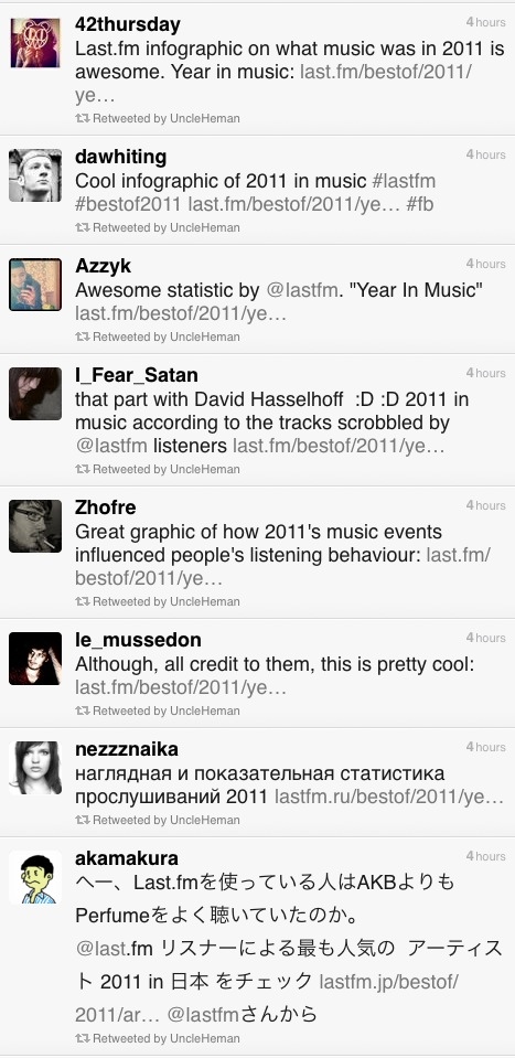
I was pleased to get a surprise present from my work-fellow @baseonmars… It’s the Last.fm “Best of 2011” infographic as an A2 poster, with a gorgeous matt finish. Thank you! He wanted a framed one for his wall at home and got me a copy… because he is awesome.
To get this to work in two columns on A2 format I had to add an extra scrobble graph not seen on the original Year in Music freature: Rebecca Black goes viral: 11 Mar – “Friday” goes viral and is dubed “the worst song ever”.
Every year at this time, most music sites give you a run down on the best acts of the year. Generally, sites start rolling out “Best of” features in December, however at Last.fm we decided to wait until January so that we can show a complete year’s worth of data. This year we’ve also added a datavis feature, which shows key Last.fm stats, including the music news events of the year that made a noticeable change in an artist’s listening levels – or scrobbles.
Making of
To create this, we polled our colleagues across the CBS Interactive group for what they felt were the key music events of the year. I then used our internal trends tool to see if the artists featured in these events had any corresponding spikes in their listening data, based on actual total daily scrobbles. To my surprise, most of the shortlisted news events had encouraged listening, showing clear spikes. The only HUGE event that hadn’t really had any effect on listening was David Hasselhoff’s birthday. The Hoff is the Last.fm mascot and his birthday is always big news here in Old Street, but sadly not with the wider world. However he did have some huge spikes in 2011, which a quick check on Wikipedia proved to be related to a come back tour in Germany and Austria, who also have great taste in idols.
A tribute to Steve Jobs
The Steve Jobs tribute was the last one to go in. I wanted to do a tribute to Steve (mostly because I am addicted to my iPhone and iPad), but mostly due to his huge impact on the world of music. The trouble is he’s not an actual artist (or so I thought), so he doesn’t have listeners to create a graph from. Instead, I used our site statistics to show how Apple devices are represented in Last.fm visitor levels. It was only later that I learned Steve Job DOES have an artist page, as many of his keynote speeches and addresses have been shared as audio files and podcasts, which do actually “scrobble” … and yes, there was a spike after his death in October.
Translation issues in web design
Last.fm is a global company and provides translations in 10 languages. Translation is usually added into the html, but as the datavis was a graphic, yours truly had to edit the translations by hand, which was fun, as not all the character sets would work in the cut of Helvetica Neue I had. Also, sentence length in translations can be a huge layout issue, especially if tabs are used. In this case the annotation of the charts took up a lot of room and needed to be considered early on. Contrary to popular belief German wasn’t the most problematic in terms of sentence length; Russian caused the most formatting problems, followed closely by Polish.
Some spring cleaning on Last.fm to clean up the typogoraphy on the site. A small change, but one that will make me very happy ; )
The first step is to make the heading levels more distinct, so there is a clearer visual hierarchy. Heading levels should have the same effect as the old eye test, noticably diminishing in size. The current site headings are a bit samey. This helps the bowser to understand how the page is divided and gives a “vertical rythm”, making it easier to scan down the page to find omething specific.
Secondly, we need to clean up the CSS and html, so that the structure of the content follows the intended visual and semantic hierarchy . H1 for page title, H2 to divide content in main themes/sections, and H3 headings to title separate under each H2. These changes will make the page legible without the stylesheet, which is not only good practice, but also frees the content for use in multiple contexts (such as mobile/tablet).
As these changes effect the structure of the site we can’t just roll them out site-wide. They’ll be included as we update various sections of the site, the first being Last.fm Charts.
A note on accessibility
CSS gurus say you should not use units like “px” or “em”. It is naughty. In this case I have used united px values as a guiding principle, the CSS will probably be unitless.
I’ve been working on a refresh of the “Charts” section of the Last.fm site, including a new filtering options for “Hype”, “Top Artists” and “Top Loved Track”. This first launch only includes filtering by date, a later release will include “genre” and “location” filters, so that you’ll be able to can see the best “electronic” music or “black death metal” in your home town. Have a play at last.fm
I’d been scanning in the family photos, which go back into the early 1800s, and was bowled over by the typography on the back promoting the photographers’ studios.
Spent ten mins this morning illustrating a molotov cocktail. It was to illustrate a spike I found in the listening trend for the song “I Predict A Riot” by the Kaiser Chiefs that corresponded to the London Riots. I’ve had worse mornings at work.
Many businesses want to develop apps but don’t have in-house resource. As an in-house designer I’ve designed a fair few apps and worked with both in-house teams and external agencies. Obviously, building a strong in-house team is best, but it’s often hard to find to recruit at the moment. In my humble experience, this is the best steps to plan your project. I have seen this done in reverse!
Define what use cases and objectives you want to satisfy
Choose an app development agency
Have a good relationship with app development agency
Come up ideas
Define a Solution
Choose the technology
Set a deadline
Find a commercial partner to co-fund (if applicable)
This is a momentous occassion for me. My all time favourite film Tandem, directed by Patrice Leconte in 1987, has been released on DVD for the first time with English subtitles in “The Essential Patrice Leconte” boxset, part of an “Auteur” series, released in Australia by leading distributer Hopscotch Films.
Patrice Leconte is best known for “The Hairdressers Husband” (Le Mari de la coiffeuse, 1990) and “The Man on the Train” (L’Homme Du Train, 2002). Tandem was his first serious film following an early career making “Carry On” style films based on French comic strips. I’m a huge fan of Patrice Leconte and have always been frustrated that so few of his films get released in the UK on DVD with subtitles. A few years ago on a trip to Paris I picked up a copy of Tandem, thinking it might be worth watching even though I wouldn’t be able to understand the dialogue. To my amazement, what should have been a frustrating 90mins turned out to be the movie experience of my life. I immediately fell in love with the characters and understood the plot even without the actual spoken words.
Tandem is a road movie and buddy movie in one and is in turns funny and movingly tragic. Through the eyes of the childlike Rivetot, the film follows the comic decline and inevitable breakdown of his boss, friend and radio star Michel Mortez. Michel’s fall also leads to a turn for the worse in Rivetot’s life. As the tagline on the 1987 trailer stated: “On a tandem, when one falls… both fall”.
Storyline from the DVD liner notes:
Michel Mortez (Jean Rochefort: Ridicule) is an aging radio personality travelling around France to compere a game he created some 25 years earlier. His sidekick producer/assistant/chauffeur Rivetot (Gerard Jugnot) always goes along for the ride and is the only one who really knows what lies under Mortez’s playful bravado. When Rivetot hears that the programme is to be axed by the managers, he delays as long as possible having to announce it to Mortez. Tandem is an offbeat and bittersweet comedy with surprising twists and turns.
Here’s a brief clip – no subs of course
The film explores one of Patrice Leconte’s favourite themes: the profundity of platonic relationships in the absence of conventional love. In Tandem the two men are prevented from forming relationships by their life on the road and only have each other for support. They have formed a bond through their years of work together, and their bickering are caring for each other forms a marriage of sorts. In essence, Rivetot and Michel would be fulfilled, if they could realise that they need each other.
Leconte explores this theme over the course of several films such as: “Parfum D’Yvonne”, “Mon Meilleur Ami”, “L’Homme Du Train” and to some extent “Tango”, a road movie about male manners and the hypocrisy of chauvinistic attitudes to women. Leconte is careful to state that the issue at hand is not sexual, although he often leaves the issue of homosexuality open. In Tandem for instance, although Michel Mortez declines when propositioned by the aged hotel night-watchman, he does seem resigned and deflated at Rivetot’s rejection of his offer to dance, and seems resigned when Rivetot doesn’t engage in conversation about their relationship, which he describes as: “an affaire drole… an affaire bizarre”. In Parfum D’Yvonne the subtext of same sex love is more clearly stated, but still the actual relationship between the two male protagonists is platonic and ambiguous. On the surface, the film appears to centre on the story of an affair between a young man, named Victor who is avoiding being drafted into the Algerian war by posing as a Russian Count, and the eponymous Yvonne, who is an actress spending her time with her older, gay friend Rene. Although following the conventional love story, the film also flashes forward to later events where Victor is seen stalking Rene as he drowns his sorrows after bidding fairwell to a young lover, a sailor on leave. Victor narrates the scene: “lovers are like criminals, they always return to the scene of the crime”. We are left to wonder who the “lovers” actually were, Victor and Y’vonne or Victor and Rene?
After several years of watching Tandem on DVD I had my first opportunity to see a rare print of Tandem with subtitles at a Patrice Leconte Season at the Lumier in Kensington. It was thrilling to discover the actual dialogue, though it did little to diminish or improve upon my understanding of the film, but did help to clear up several mysteries – such as the last line, which I’d never been able to translate (when I say “I” I mean my missus, who is fluent in French).
My fascination for the film has often lead me to Google: “Tandem Patrice Leconte” in quiet moments at work over the years, and a month ago I was rewarded for this habit when I came across a 2 volume Patrice Leconte box set which featured Tandem, newly released in Australia. I never knew he was so big down under! A cultured lot, those Australians. I admire them all the more.
The most affordable copy I could find was actually in the US. It arrived today.
Thank you so much Hopscotch Entertainment.
I’ve been checking the reviews for the Time Out Travel Guide apps I worked on last year. It’s good to think of someone using a product you’ve designed and even better that it’s helping them have a good holiday. Dubrovnik, London, New York, Paris, & Zagreb
iTunes reviews
Berlin – Take full advantage
This is a great app and successfully navigated us to some top spots in Berlin over Easter. Currently free, which is an absolute gift – take full advantage. By Sazzle_81
Paris – Discovered a new Paris
I have been to Paris hundreds of times and have even lived there, but I discovered a completely new side to it this weekend through this app. We followed the editor’s picks and used the what’s nearby part of the app and we had the best weekend ever! Next time I will plan more and use the bookmarks to organise each day. No Improvements necessary. By Dysynni
Berlin – Absolutely essential
We used this app around 10 times a day instead of getting charged for data raoming and it was brilliant. I would have paid for this so can’t believe it’s free. If you’re travelling to Berlin, why haven’t you downloaded it already!!! By Tom Hughes
Barcelona – Absolutley indispensible…
Almost flawless in execution, this app is all you need if you turn up to Barcelona without a guide book or any clue what to do.
We spent 6 days there and filled them with things we found on here. The user interface is superb, the ability to bookmark and then view on the map was genius, and all without using any data allowance.
Only occasionally was the GPS slightly off and one or two places weren’t quite where the map thought they were, but overall it’s the best and most useful city guide app that I’ve ever used. By Doug Bryson
New York – Amazing
It made my trip to New York much easier when wandering around. Offline map, great restaurant recommendations, nice photos. I am totally getting the London and Paris guides. Please make a Lisbon one. By syt8
Some interesting articles – I’ve had a lot of experience using externl agencies to develop apps , this articles outlines why that model doesn’t often lead to a great product:
The End of Client Services
…it’s very hard for a design studio to create digital products on a contract basis because the messy timelines and continual course corrections that are required to launch a truly effective software product are anathema to the way clients like to be billed. No matter what a design studio promises, it’s very likely that in its first iteration a digital product will take longer to complete, will cost more, and will be less effective than originally promised. The most critical time for designers to be involved in a digital product is all the time, but it’s perhaps most important for them to stick around after the launch, when they can see how a real user base is using it, and then amend, refine, revise and evolve it. But it’s at just about this time that most studios are preparing invoices and shuffling their staff on to other clients’ projects. – Khoi Vihn
And this article is a call out to designers to ditch their own studio or freelance dreams in favour of joining (or starting) a start-up in this new app landscape:
Dear Graphic and Web Designers, please understand that there are greater opportunities available to you.
The internet, at this time in history, is the greatest client assignment of all time. The Western world is porting itself over to the web in mind and deed and is looking to make itself comfortable and productive. It’s every person in the world, connected to every other person in the world, and no one fully understands how to make best use of this new reality because no one has seen anything like it before. The internet wants to hire you to build stuff for it because its trying to figure out what it can do. It’s offering you a blank check and asking you to come up with something fascinating and useful that it can embrace en masse, to the benefit of everyone.
Your press checks are bullshit
Your personal logo is bullshit
Your employer is bullshit
Your studio is bullshit
I’m not suggesting that you shouldn’t start your own company. I just think that for a lot of designers, from what I’ve seen, this is jumping the gun. Unless you have a friend who is an engineer, it is going to be difficult for you to find someone of quality to build something for you, the professional landscape for those people is just too competitive right now for much of that. But I guarantee you’ll develop relationships with engineers if you go work at a startup, and from working relationships good conversations brew and companies are born.
In an effort to maintain consistency and quality of our application icons, I have been collating a GUI (Graphical user interface) reference doc. As we produce applications on different devices and platforms, we need to take native UI styles and features into account. Although there can be no “generic” iconon all platforms, we can still achieve a consistency of drawing shape and general ‘character’ of icons across apps. For instance: to create tab and activity icons in iOS you provide white shapes on transparent backgrounds, the “blue gloss” styling is added dynamically within the app.
This matrix is more of “how are we doing” document to see if Last.fm style shines through the veneer of native UI styling. The grid shows platforms in columns (names removed for confidentiality of work in progress) and the rows display the various activity states: rest, hover, press)
Abiatha Swelter, Chief Chef of Gormenghast" pen and ink sketch, signed "Mervyn Peake '47"
A newly discovered re-surfaced (!) sketch by Mervyn Peake came up for sale this weekend in an exhibition at “The First Tuesday Society” gallery in Hackney to mark the centenery of the author’s birth. The pen and ink sketch, sent as a gift in a letter to friend of Mervyn Peake, is of “Abiatha Swelter, the Chief Chef of Gormenghast”, a charcter in Peake’s “Titus Groan” saga. The sketch was part of a vast collection offered for sale by Peake collector and rare book dealer Mike Kemp.
I’ve been a Peake fan for 20 years and have helped out on the Peake website on and off for 10 years and I had never heard of this sketch, but Peake biographer and scholar Peter Winnington informs me that it’s been in Peake Studies before. Which goes to show that a 20 year obsession only gives you only a glimmer of knowledge of such a prolific talent.
So Peter… did Peake ever draw a detailed picture of Gormenghast itself? That would really be news.
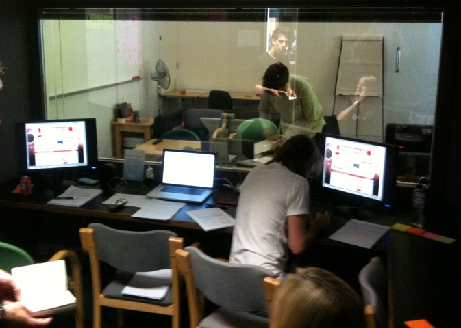
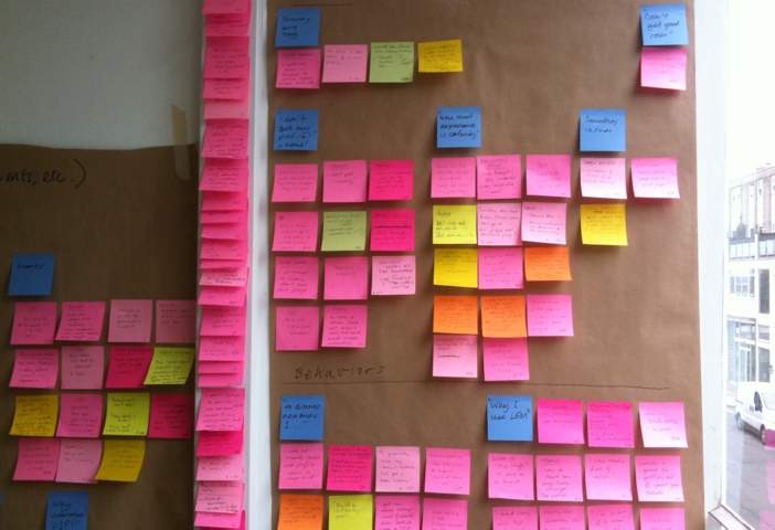
My favorite place: testing stuff in the lab behind a one-way mirror. I moderated a couple of the sessions, which were with existing LFM users. We hired the excellent user research fascilities at Flow Interactive in Clerkenwell, mostly because they have air-con and a fridge full of coke.
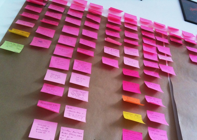
We made notes on post-its, one observation per note, with quotes from users to back up observations. We used rolls of brown paper to collect and store the notes for taking away later, the paper was divided into the broad themes we were testing. Back at the office we sorted the post-its more thoroughly into columns under more exacting topics. Several people were taking notes so we had to de-dupe, however it was important to keep similar comments if made by different users, as this indicates that the issue might be more common to a wider group.
The death of a thousand notes
Affinity Sorting
The next step is to do an “affinity sort” to look at each comment individually and sort them into groups based on perceived patterns, rather than features. It’s important to start quite freely and not to place a heading above the group or draw a conclusion too quickly. It’s basically finding groupings based on a gut feeling that different users were having similar issues. In this research session we were testing different features, such as “Events & Festivals” and “Artist Library”. In afinity sorting I noticed that a user who couldn’t find their recommended events was probably having a similar issue to a user who couldn’t find their recommended artists in the “library” section. These two notes were moved from their former “feature” headings into a new group called: “Issue with finding personal recs”. The issue had nothing to do with events or radio, it was a issue around users needing a uniform place to access all their personalised info.
Last.fm Festivals app won a 2012 W3 Silver Award for the Music & Audio Mobile App category and a 2012 Mobile WebAward from the Web Marketing Association. You can download the app on iTunes here.
My part in the project was to: create a set of wireframes, work out the userflows, provide UI and marketing assets, and follow up with QA and bug testing.
Features
Festival compatibility – find the best fesitval for you based on the artists you listen to.
Recommended line-up – picks out the artists you listen to most in each festival.
Sort by location – people travel for festivals, your ideal festival may be on another continent!
My List – plan your summer festival season and save festivals you’re interested in
Friends – see all the festivals your friends are attending.
Easy Gourmet Catering are based in East London and produce gorgeous food for weddings, events and private functions.
Easy Gourmet Catering’s new CMS site is live. I designed and developed the site, as well as creating a new logo and brand. Still some holes in the content, but it’s good to get it live to let Google start indexing.
I started what I though would be the slow process of switching the DNS with the current host (the mammothlyg expensive Netbenefit) only to find things happened super quick. Then had to migrate 8 pop email accounts and set up the necessary forwarding the client was using – which meant learning how to migrate pop email FAST! Always a good way to learn 😉
The design and build of the site took 2 months and was completed in January, however putting the content has taken much longer. Easy Gourmet had great help from my friend Michael, who is an excellent editor and travel writer. However, this kind of content is quite personal to the business and needed a lot of involvement and consultation with the client, Marie, and running a successful catering company keeps her very busy.
Better SEO
The most exciting part of this project is the SEO opportunity. The old site was poorly structured and not at all optimised. I did an audit of the 40 most likely customer search queries in Google for page rank (e.g. Wedding caterer”, “Catering London”, “wedding reception catering”). I found only the exact company name “Easy Gourmet Catering” returned a page 1 listing, and that was compromised by a competitor with a similar name in the second position. For all the other search terms there was no listing at all. The new CMS structure and some basic copy alone should give this site a decent presence in search results, but with Michael’s rich copy and some “white hat” optimisation tricks of mine, I think this site will start to be SEO competitive. Google generally takes between 7-14 days to re-index a change on a site; there is an unconfirmed theory that Google is slow to react because it “sandboxes” changes.
Easy Gourmet Catering is a successful business now, even without the aid of natural search listings, woth this new site it should explode! If, that is, people really choose caterers from the web, or if it’s more of a word-of-mouth reputation based business.
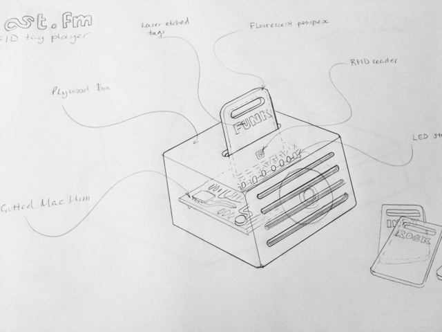
There are lots of boffins and whiz kids at Last.fm, and I’ve been task with conceptualising something they could make based on RFID tags for interacting with music data and streams. (RFIDs are little stickers with antennaes for use in contactless technology – like Oyster cards)
I’ve been sketch ideas for a fun way to change the genre of music on the reception radio stream using physical objects that have RFID stickers on them.
The first idea is for a stand-alone player using the guts of a Mac mini, stuffed in a box made of plywood, that has a slot in it for fluorescent perspex tag cards. Ram in the “pink” card and the box would light-up and the radio stream would switch to pure FUNK-FUNK. Other cards would be available… but only if you need something better than funk.
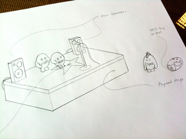
The other idea is to make little action figures based on the Last.fm “scrobblin” brand characters, with RFIDs on their feet that you place on a miniature stage containing the RFID reader. You could then make a mix stream by putting a number of scrobblin tags together to form a band, for instance: “electro emo funk rock”.


")

")
 translated into Japanese")
")