Last.fm reception mural - illustration by Rehab Studio
The artist who pianted this mural was using an old transparency projector to trace the art, so I needed to give him a clean line-art version of the original vector file. I also helped to slecet the colours. Although there was some initial confusion as he wasn’t given a definitive pantone…
There are actualy 3 reds in use across various mediums: Pantone 1797 & 1087 and Hex #d51007.
To keep things simple, and as the mural looks great in th sun… I’m now claiming Rectory Red is the official colour. Anyone who wants a swatch has to go and chip a bit off the wall.
It’s very easy to get lost when designing an app, but when you’re designing for a touch-screen experience, with gestures replacing clicks and scrolling, it’s even more complicated. Touch-screens introduce physical concepts to help the user navigate: spatial planes that you can “swipe” across, representations of physical objects, and zooming in and out and content. This makes the user flow in and out of content very tricky.
Immersive Vs productivity apps
In a productivity app, like email, its better if a user can drill in and out of tasks in a straightforward way. Therefore the folder based metaphor of desktop operation systems makes sense. But for a more immersive experience where you want the user to get “lost” in the experience, you need a more “open’ and loose heirachy. In my experience, “Open” is very hard to develop… as it’s harder to anticipate all the possible routes and outcomes, so the UI presents consistent behavious where ever the user is.
In this example I’m looking at an immersive touch-screen way to explore music artists. A list of artists is presented as a photo grid (or quilt), and the user can zoom into the grid to look at an individual artist. They can then swipe left and right to see the next artist in the grid. This mixes two existing navigation metaphors: picture thumbnail gallery and a page-turn magazine experience. Phew.
But now the hard bit…
Every artist has similar, or related, artists. Daft Punk has: Justice, deadmau5, Digitalism, etc. We want to encourage the user to follow these connections and explore more artists freely, but at the same time, need to give them a clear way back to the start of the app.
Browsing music artists using touch gestures model 1
Model 1
The user zooms in on an artists, then when the click on a related artists, that opens another grid. In the programming model, each artist opens as a new level in the app, and each related artist grid is another level on top. Phew! The layers build and build, and for to get back to the start, do they have to press “back” through each of these layers?
Browsing music artists using touch gestures model 2
Model 2
The user can zoom in and out of the grid to see artists, but if they want to click on a related artists, that launches a new grid in a new session. To get back, the user goes from grid to grid. It’s more like a concept of islands of artists, than levels. This will be much easier to develop, as each time you press to see a set or related artists, you are clearing he grid before, much like performing a new search.
If this comes across as an incoherent ramble, it is because my mind has been broken by too long in front of the whiteboard!
Some random sketches, thinking about a way to visualise the tricky concept of scrobbling. These are based on new stuff floating around in my head mixed with exisiting ideas and metaphors. So far I have: clouds, “scrobblins” (my new name for the brand characters created by the Rehab Studio), hearts, headphones & stethoscopes.
Based on existing illustration work from the excellent Rehab for the Best of 2010 site, this icon will be the new face of a desktop player app. I took the more anatomical heart drawing and simplified it, then added the woofer and tweeters for play-your-music-love-metaphor-iconess.
This links to a series of flat designs to click through.
Second iteration ideas for my Graeme Balfour, who needs a unified personal/professional identity and website design. The gesturecons from the first iteration are still planned, but the more urgent issue is to get the web presence sorted.
These are sketches for a professional identity for a friend who has a very diverse skill-set: massage therapist, yoga teacher and usability consultant.
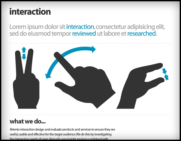
The easy route would be to treat each strand separately. But that’s no fun. There was already a nice idea of using hands as a conceptual image for the massage, the leap was to tie that into “interaction and usabilty”… oh and “Yoga”.
As often happens, there was a bit of serendipity: earlier that week a colleague had introduced me to a really nice set of “gesturecons” (illustrations used in diagrams to demonstrate how to use software on touc-screen devices) for a user-flow diagram I was doing. Massage is about touch, so why not use gesturecons to illustrate massage movements?
Trying to tie this concept into yoga was a but more work. Then I remembered that in yoga books you often have figurative diagrams to demonstrate postures, and in yoga there are postures just for the hands, called “mudras”.
It seemed to fit quite nicely as an idea, hands that massage, a hand in a meditative mudra, and a hand performing an interactive gesture.
I’ve had the opportunity to move from print design to web design to app design.
Looking back over these very different mediums, each has a learning curve, each has very different thinking and best practice. But the hardest part is that going from one medium to another requires you to “forget” the thinking of the previous medium.
“Your must un-learn what you have learned” – Yoda
In print there are categories and indexes to organise your content, on the web you can slice and filter the content dynamically by combinations of categories and tags, with apps (on touchscreen devices) you have a new interaction model based on “direct manipulation”, where utility needs to be more focused and access to content needs to be flatter and more direct.
One app – one function.
In the web world, if you wanted to offer 5 different things you’d have 5 sections on your site, in the app model, it’s better to make five different apps and focus them clearly around one task, defined by an application definition statement. It’s not a hard rule, more a principle that will help to make a better, more straightforward app.
The magazine metaphor
The iPad has ignited a great deal of excitement and activity from the news and magazine nedia, who are eager to find a new avenue for thier content in the face of years of competition from the free web.
Certainly, apps like Flipboard have shown there is great potential in the magazine browsing metaphor for consuming any kind of content, in fact trad publishers are signing up to delver their content through Flipboard (Lonely Planet Mag, Washington Post).
The Ecomonist iPad app
The challenge for these companies is to make the most of this potential without reverting to print thinking when it comes to content structure. The periodic “issue” may make sense and feel comfortable commercially, but seem anachronistic on an iPad constantly wired to the web. Wired and The Economist deliver periodically, despite the fact their websites have “live” content.
It’s a bit of a downer to open an app to find there’ll be nothing new for another week or month. Just like discovering just missed your favourite TV show only to find they don’t do “on demand” and have to wait for a scheduled repeat. Old skool.
When I first designed the Books With Bite site Hachette didn’t have a logo ready, so I quickly mocked one up (below) and they were happy to keep it. Now the in-house team have a new logo, made from one of the cover illustrations and the house fonts Goudy Old Style and some other funky distressed font called “Beach”. The new logo fits the site really well and still has dripping blood to fill the “glass vial” nav panel, though I think my treatment was more sublte ; )
Read the iOS Human Interface Guide lines
Apple know what they’re talking about, and it’s better to be inspired by built-in apps than by copying competitors. One word of warning though… don’t assume that all functionality in built-in apps is available in the SDK. It ain’t always! iOS Human Interface Guidelines
Write an “Application Definition Statement”
An ADS helps you to focus the app and keep it simple. You need to define the:
USP – what makes it a cut above the rest?
Purpose of the app
Who is the app for?
Then, if at any point you think of other features (or if some smart-alec starts pitching in), alwasy check it against the core purpose of the app, to make sure you’re not overcomplicating things and bloating the app.
Write a feature list
of all the things users might like. I brainstorm this through think-maps and work-flow diagrams to think through the various uses of this app, and the processes people use in the real world to achieve the same tasks. Compare the feature list against the ASD and focus the app to core features. Do I really need to offer offline browsing, when the core purpose is user is out and about and needs to look something up”.
Work out the key screens
Make quick paper prototypes to help think through different models and identify which key screens need designing to show a user through a task (or tasks).
Prototype
Create paper prototypes the most successful models to test with users. Alternatively, you can put your flat designs into the “Photos” app, to give users a more hands-on experience.
Test, iterate, and test again I prefer batches of 5-10 users. Keep iterating until every user is sailing through the tasks your app is designed to fulfill, and when you feel confident enough to swear on a stack of bibles you’ve nailed it.
Design your final UI
The lovely chaps at www.teehanlax.com have created an Adobe Photoshop layered PSD of the iPad and iPhone GUI, which will save you a million years. My tip would be to use this for designing only. When it comes to building the app, use as much of the built-in UI assets and styling as available, rather than slicing all the graphics from your design. Here’s the iPad GUI
I spent some time last night drawing the final logo artwork for Easy Gourmet. The font is Bodoni Script Pro by Parachute, chosen for the classic heritage of Fuller Benton’s Bodoni, and the script fulfilled the client’s desire for curviness and femininity. I converted the font to outlines in Adobe Illustrator so I could attached the “Heart signature” to the flourish of the “G”.
Bézier Curves
If you’re unfamiliar with Bézier curves, they are tool to draw curves and make shapes in a computer. A shape in a drawing program, such as Abode Illustrator, is made of points called “vectors” connected by lines, called “paths”, and filled with either a colour or a blend of colours called “gradients”. Initially you draw a shape using a shape tool (ovals, rectangles) or using a virtual pen tool. To change or “edit” a shape you click on or near the edge of the shape, this brings up the points as little black squares, clicking on one of these squares reveals the “control points”, which are like little sea-saw levers. Over time, using these control levers becomes quite intuitive, although at first they can drive you nuts.
Spread of the Eyewitness Music book published by Dorling Kindersley
It’s a skill I picked up creating hundreds of clipping paths for images at Dorling Kindersley, where the famous style was text flowing around cut out images on white backgrounds. The only way to do this then was a cruder version of the curves in the “path” tool in Photoshop.
Bézier curves were developed by Pierre Bézier (Wikipedia), a French engineer who pioneered computer-aided design at Renault where the curves were used to design care bodies.
The Wikipedia page on Bézier curves has really nice animations on the maths behind the little handles and pivots you use to control the curve. I don’t understand them, but they are pretty in a geeky sort-of-way…
In the photograph I was using to draw this logo, which represents the decoration made from a drop of cream in a fruit coulis, it looked like a leaf. They are in fact hearts. So I have updated my Illustrator rendering for this logo mark. The shape is more feminine now and will compliment the image of the (still secret) company and it’s owners. Original design is below.
I had good meeting last night to agree the new logo for a (not to be named yet, but look really closely at the pics and you might be able to make it out) catering company and to discuss colour ways.
It was way too early to be coming up with designs for the site but, as I always get over-excited and had done a whole bunch of work to test out the new logo. Generally it’s not good practice to show such early design work to clients as it can confuse the issue, rather than presenting complete work that you are confident in. Also, if you show to many options you can end up getting asked for: “a bit of this design A mixed with a bit of that design B”, which might not work well together – and then you have a camel on your hands!
In this case I had a good feeling about the work so far and I thought it would be helpful to show the client how the identity would work in a real context. And I thought “hey, they’re chefs, they understand about mixing the right ingredients”.
20 minutes later and not only was the logo signed off, but we were well on our way to agreeing the website look and feel. This was followed by Guinness at Wiltons Music Hall. I was very happy : )
I’m just showing off really ; ) … trying to make this whole “designer” thing seem glamourours. It’s actually just a lot of squinting at screens for long hours getting eye-strain and swearing furiously at feedback emails!
Whenever I design a logo, I always look for an opportunity for a monogram.
Mongrams are great for extending the uses of a logo and if there’s a need for a smaller version, such as icons or badges and labels in the real world.
The example above is the identity I’m working on for a rather chic catering & events company, but I’m still not quite allowed to shout about it yet, I can’t help let a few ambiguous designs out of the bag ; )
Above are 4 sample colour ways for a new brand and website. Choosing colour is a complex problem, not only are there countless choices, there are also: gut reactions, personal tastes & physical differences in each person’s perception of colour to take into account.
With everything I do, I take inspiration from what the client gives me, in this case it was the photography of the food this company produces, as well as the table wear they use to present their food. I then select complimentary and accent colours to use as highlights, rollovers or side-boxes, to give site contrast and pace.
One handy tool is Adobe’s http://kuler.adobe.com which has user generated pallets as well as a tool to find complimentary or contrasting colours based on the standard principles of colour theory. I use “triad” to give a strong contrast.
Mostly though, I use my own judgement. This tool just helps to play around a little.
In the photograph I was using to draw this logo, which represents the decoration made from a drop of cream in a fruit coulis, it looked like a leaf. They are in fact hearts. So I have updated my Illustrator rendering for this logo mark. The shape is more feminine now and will compliment the image of the (still secret) company and it’s owners. Original design is below.
Above: Attendees to the Gauguin exhibition Vs Urban Nerd’s Halloween club night.
Time Out’s Facebook integration is starting to gain momentum and events are starting to get good “attendance” numbers on the site. It’s interesting to be able to compare the audiences for differing events, as well as to see the real faces of Time Out visitors for the first time (Previous Facebook “fan pages” didn’t really represent engaged, event going, users).
Note the picture of Christopher Walken, 3rd pic top row. Sin-Jin Smyth is the team’s test profile. A nice reference to the final Moore Bond Film “A View to a Kill”, which is a camp masterpiece and a great Bond film, dispite Roger’s advancing years.
This is a little “day range” selector to help manage the feed list in My Time Out, which can get quite long and unwieldy. Being developed soon. The next iteration will allow you to select a weekend move that selection forward in time. Getting closer to the “browse by time” concept I came to Time Out ages ago.
www.bookswithbite.co.uk is progressing well and is being filled with content, which is managed a by Joomla CMS. I love all the ornaments which I merrily stole from one of the jacket designs. It really gives it that Gothic/Victoriana thing. The site is due to launch soon.
So, someone at a party says: “you’re a web designer right?”… a bottle of fizz or two later and I’m offering ideas, sketches, free stuff. You know how it goes ; )
Might turn into something good. These are some initial designs for a brand element. I cannot reveal more.


")