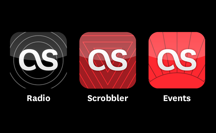
Following the iOS design principle of “do one thing really well” we decided to spilt the Last.fm service into three distinct apps which serve clearly different use: radio streaming, exploring and scrobbling your music collection, and finding events to see. This meant coming up with a family of icons that were different enough to be distinct, yet belonged together and clearly reflected the brand.
The solution was inspired in part by the style of exisiting brand illustrations, but simplified and using geometric shapes. Each icon has a loose concept:
Radio: (Obvious!) is personal radio, so radiating waves… no brainer.
Scrobbler: The Scrobbler enhances your local music collection with Last.fm UGC tagging data and creates automated personal playlists. The icon shows inverted triangles, representing focusing lots of music down to the point of the tracks you really want to listen to.
Events: The icon shows a horizon with points radiating out, representing the points of a globe where you can see your music live.
